Sydney Sweeney and the Dr. Squatch marketing team did not need to create a false utopia to market bathing soap. Selling bathwater related items has happened before and frankly, I don’t see the appeal. In class, we discussed soap advertising and its visual representation of women as care takers in the Victorian era, and its effects on how women are viewed. Many soap advertisements came about during a new reconstruction of society, suggesting cleanliness to be a moral right and being dirty a moral wrong. Women were often representatives of these advertisements, but not just any women, rather they were white, beautiful, and matched the image the society wanted to go with. In contemporary times, advertisements are seen as completely inclusive, distributing equal jobs between genders such as childcare and cleanliness. However, there are still some visual representations that enter the sphere and often cause controversy. For my final paper, I wrote on the negative effects that the Sydney Sweeney “Bathwater Bliss” soap could have on future generations, and ways that advertisers could pivot to more inclusive advertising. There are many advertisements around the internet, but the one I focused on features Sweeney in a bathtub with beautiful scenery in the background. Though the advertisement may seem harmless it is very similar to a Pears’ Soap ad seemingly showcasing the same background of Grecian columns and hardly clothed women either draped in silk or covered in bubbles. While one advertisement shows a woman at work (bathing a child), the other advertisement shows leisure without labor (a concept introduced by Anne McClintock in Imperial Leather). Pears’ Soap’s slogan “For the Complexion” is very telling to who its target audience is, white housewives whose ideas of cleanliness were changing. Sweeney’s custom slogan provided by the internet read “Sydney Sweeney wants you to quit being a dirty little boy.” These advertisements seem empowering, however they reinforce that women are merely spectacles to show and sell household items. It must change to actually empower women rather than use them as objects.
Victorian soap advertising bleeds through contemporary advertising
Posted in Uncategorized | Tags: soap-advertising, victorian advertising
The dangerous evolution of police photography
The idea of police departments utilizing photographs to document who they book and who their inmates are sounds like an idea worth exploring, until you get to the more technical questions. What information should be included when processing these people? The shift from the wealthy only being able to have their portraits painted to photography being used to capture the essence of a criminal became a tool of classification and control of the human body in policing. Allan Sekula, author of The Body and The Archive, unpacks the inconsistencies of Bertillon’s thought of individualism as only a statistic, not something to be seen as humane, though Bertillon believed it to be so. Through ironic juxtaposition, Sekula reveals Bertillon’s impulse to classify individualism and how that turns into viewing the individual as not human, but as a mere statistic from a metaphysical standpoint, and how truly harmful that turns out to be. I argue how Bertillon’s method is especially dangerous in terms of racial identity. Policing and photography was something that I did not think about much until this class. The shift from the privileged and wealthy only being able to have their portraits painted all the way to photography being used to capture the essence of a criminal became a tool of classification and control of the human body. The creation of the Bertillon Card/Bertillonage can be slightly attributed to creating the modern way of identification for inmates, but it is worth noting that the Bertillon card was a huge failure. Sekula does a remarkable job pointing out the irony of Bertillon’s argument on why his methods of identification could work. Looking at it through my body, I believe that this method would have especially been dangerous to people of color. Bertillon suggested that his method was for the good of the people, that surveillance was a good thing, but has historically been used against marginalized communities. In my midterm, I looked at a card assigned to a well-dressed, well-groomed Mexican man and thought of how the card could have been misused to identify Mexican-Americans in the future. From the Zoot-suit riots to the Chicano movement, a multitude of Mexican-Americans were obviously arrested, and this card would hold only unnecessary information to stereotype a Mexican person to arrest more in the future which similar attributes. Though the Bertillon card no longer exists, the stereotyping of this marginalized group around the country is absolutely more dangerous than what the card itself could have done.
Posted in Uncategorized | Tags: photography, police-photography
Yinka Shonibare (Dorian Gray)
We did not have much time to go over Shonibare’s exhibit our last class but with the quick glance I saw on the last day I knew that it was something I would definetly research more. Shonibare is one of the most interesting artists I’ve ever seen, the way he integrates himself into historical scenes especially those where there is no other racial minorities present is very interesting. What is really cool is his use of different african textiles in exhibits that are in different parts of the world such as Germany and the UK. A particular exhibit that stood out to me was To Be Free: Art and Liberty (2023).

The image of Lady Justice is one I knew of already but the inclusion of the globe for the head and the dress is Dutch wax batik (or Ankara) an intricate African wax print that acts as an important representation of African culture. Wheareas the globe on the head stand for the idea of Lady justice being a universal identity for all not just a representation of one culture or country but many. One of Yinkas other most popular works is his photographic suite framing himself into the Oscar Wildes Dorian Gray.
Yinka transforms himself into the Picture of Dorian Gray already bringing new perspective to this Victorian scene. While also bringing an element of the african identity to thses primarily british victorian settings. Although all the pictures featured are in black and white but one the atmosphere he creates is one reminiscent of the book, mysterious, cloaked, and leaves the audience looking closely into what his reimagining of the scene brings to their previous understanding of Dorian Gray.
Works Cited
“Yinka Shonibare MBE || Dorian Gray.” 2009. Africa.si.edu. November 10, 2009. https://africa.si.edu/exhibits/shonibare/dorian.html.
Posted in Uncategorized
The Power that lies in Portaiture
At the beginning of this course, I clearly remembered in depth analysis of the portrait Lady Betty Delme and her Children(1777-79). It served as a strong introduction into nineteenth-century Victorian portraiture because, at first glance, the viewer is presented with a seemingly simple image of a mother posing with her two children in an exapanzive landscape. However, through close analysis, we uncovered the various power structures latent within the construction of the scene.
Lady Delme’s clothing is long and oppulent, impractical for the outdoor environment in which she is depicted. She is positioned with her son closest to her, while her daughter stands on the outside, hugging her brother. This arrangement displays the inherent power granted to the son as the male heir to the estate. While the daughter’s outfit is relatively appropriate for her age, the son is dressed in finer fabric and a design more suited to showcasing his rank within the family structure one that untlimately supasses even that of his mother, Lady Delme. Lastly, I noted the inclusion of a dog in the portrait, which not only emphasizes the family’s wealth suggested by both the pet and enormous estate in the background but is also is also positioned looking towards the son, as if recognizing the individual who holds power and will wield higher authority in the future.
In conversation with this piece, I encountered a another work recently, Bélizaire and the Frey Children (ca. 1837) which similarily contains many underlying meanings of popwer behind what initially was assumed to be a conventional domestic depiction.
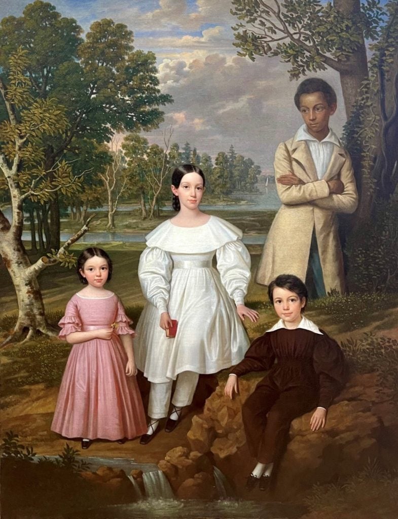
The portrait itself was comissioned by Federick Frey a banker and merchant who lived in the French Quarter around 1837 with his wife and two children. The original portrait of the wife and two kids sold for a huge amount in 2012 at $165,000. The portrait on its face depicted much like Lady Delme a domestic scene of an affulent family, however what lay uncovered was the face of Belizaire who was an enslaved teenager painted over in the righthand side of the portrait. Once uncovered historians noted his the close positioning of his subject to Coralie Frey and the other children. At the same time adorning oppulent clothes that don’t only establish him as close to the family but as an established family member and Federicks potential eledest son.
While studying this portrait ,I was immediately brought back to that first analysis at the beginning of the course, as I disected the various unseen power relations in the Bélizaire and the Frey Children and understood further how important as a whole portraiture was in conveying the inherent wealth and power, while also showcasing the relationship between family members we would nothave previously known. It only further shows how different aspects of portraiture were exhibited in the Victorian era and all over the world.
Works Cited
“Lady Elizabeth Delmé and Her Children by Sir Joshua Reynolds.” 2025. National Gallery of Art. 2025. https://www.nga.gov/artworks/102-lady-elizabeth-delme-and-her-children.
Cascone, Sarah. 2023. “An 1837 Portrait of an Enslaved Child, Obscured by Overpainting for a Century, Has Been Restored and Acquired by the Met.” Artnet News. August 15, 2023. https://news.artnet.com/art-world/met-museum-acquires-enslaved-portrait-2350056.
Posted in Uncategorized | Tags: art, Painting, photography, portraits, portraiture
The Language of Queer Desire in Oscar Wilde’s Salome
After reading The Portrait of Dorian Gray, I revisited Salomé to chart where there might be queerness encoded in the play’s language. To do so, I began with the conversation between The Young Syrian and The Page of Herodias during which they speak of a desire for Salomé and the moon. Within this conversation, they repeatedly describe her beauty as having a “strange look.” This language of strangeness resurfacing when Salomé looks upon her objects of desire, ultimately fixing her sight onto Jokanaan. When first hearing his voice she remarks “What a strange voice!” and then later after he has been beheaded “thy voice was a censer that scattered strange perfumes, and when I looked on thee I heard a strange music.” For a play rooted in similes and descriptions, I find it interesting that at the moment of desire unraveling, in which it is actually named, it is never identified beyond this feeling of strangeness. She cannot express her desire or place its difference because she hasn’t been given the language to do so.
Yet, she shares a language with The Young Syrian, her words of desire the same as the ones he projects onto her. When holding Jokanaan as her object of affection, she uses the language of men to express her attraction. She is described by The Young Syrian as “like the shadow of a white rose in a mirror of silver” or “like a silver flower,” and when she turns to Jokanaan, she remarks that “He is like an image of silver…He is like a moonbeam, like a shaft of silver.” Naturally, silver is a coveted material and so it makes sense that it would represent a sort of exchange of attraction. But in the play, silver also represents chastity and purity, tied to the moon, herself, and Jokanaan. She covets what he fundamentally has, a wish to distance herself from the men around her who force their sexual impulses onto her image. This comes to a head when she asks for “the head of Jokanaan in a silver charger” a direct manifestation of her want for equal exchange.
The type of attraction explored in Salomé is inherently displaced. It cannot be fully identified and so is made strange, only described in similes that struggle with placing what the essence of this attraction is. I would argue that Salomé herself is an embodiment of queerness, likening herself to the men of the play through the language she uses. This is especially seen when she does finally receive the head of Jokanaan. Her language is violent, penetrative, kissing his dead lips and swearing to “bite it with my teeth as one bites a ripe fruit” saying she will “do with it what I will.” She perpetuates the same objectification that was done onto her, onto the only other body that is believed to be chaste in the play. This is where I have a reservation calling her attraction queer. It is clear to me that Wilde’s Salomé is one that has been abused on the basis of her sexuality and body, objectified by her father and all the men around her. This moment with Jokanaan serves as the only moment where she can exercise this same desire herself. It is violent and masculine in the world of the play, but it is also born from the abuse done to her.
This is part of what transforms her into the “monstrous” towards the end of the play. She usurps a masculine sexual role and is therefore deviant and dangerous. Whether or not she is actually masculine is arbitrary, what matters is that she is expressing the language of forbidden desire and is then punished for it. This is most obvious in Herod’s declaration that “what she has done is a great crime.” It is almost impossible to not read queerness coded in her expression of a desire that is criminalized, even if she herself is a woman experiencing a sexual awakening for a man.
Posted in Uncategorized | Tags: language of desire, oscar wilde, queer, queerness, Salome, theatre
Illustrations of Goblin Market by Dante Gabriel Rosetti
I want to attempt a close reading of two particular illustrations of Christina Rossetti’s poem Goblin Market. But an interesting aspect of the analysis which I wish to conduct is that realm of slblinghood, as the illustrator is none other than Rosetti’s arguably more famous brother, Dante Gabriel Rosetti.
The Met’s website says this of the first illustration, “In August 1861, Rossetti proposed to the publisher Alexander Macmillan that he create”brotherly designs” to illustrate a volume of his sister Christina’s poetry. This drawing is reproduced on the title page of “The Goblin Market and Other Poems.” Finished by mid-December, the image was transfered to a wooden block by Rossetti, engraved by William J. Linton and printed and published in April 1862. As if in a fairy tale, we glimpse sisters sleeping in a curtained bed as goblins cavort in the background, the design echoing the related poem which treats temptation and addiction in a symbolic manner and evokes their strength through heightened, sensual verse. At an earlier moment in the story Lizzie manages to resist the goblins’s offer of luscious fruit, but Laura succumbs. The young women here sleep peacefully, unaware of the addictive substance that will soon bring Laura close to death and force her sister to undertake an heroic confrontation with the goblins.” The illustration is a direct reference to the line, “golden head by golden head,” depicting the girls in a tight embrace of affection as they rest in the safety of each other’s arms. Rosetti depicts the goblins as far-off figures, with little detail given to their characters. They rest in a circle, almost as if they represent the moon and stars who gaze in on the girls just a few lines later. It is fascinating to see this scene of sibling affection; the clear possibility of a queer relationship is especially compelling, and strangely so, when it comes from the brother of the woman who wrote the poem about such themes herself. It is also essential that this was the image used as the frontispiece for Christina’s poem. An illustrated depiction of women loving each other physically and emotionally is the first image associated with these versions of the text.
The second illustration is fascinating for close analysis. Still, it does not have as much to do with the sibling relationship as the image rests the majority of its focus upon the sisters, the first to fall prey to the goblin’s eerie calls, Laura. The illustration depicts Laura as if in a devilish covenant with the goblins’ animalistic figures. The image directly represents the curious transaction that occurs between Laura and the Goblins when she says she has no money to pay for the goblins ‘ wear. The goblins are symbolic representations of the wares they sell; there is a sense of the global market in their exotic and worldly natures, as well as a sense of the sensual market. Additionally, the goblins in the poem and in this image represent a violence towards women that tempts the young ladies as they tempt Laura and Lizzie. The represenation of the goblin in this illustration by Dante Gabriel Rosetti it quite facinating in the context of the larger poem because it implicates the reader as the person yearning for their desire of the fruits, as if Lizze is saying to us too, “you must not look at goblin men” (lines 42-44) but here we are looking at them ovwer and over as they are encribed upon this version of Goblin Market’s text.
Works cited
“Dante Gabriel Rossetti | Head by Golden Head, for “the Goblin Market.”” The Metropolitan Museum of Art, http://www.metmuseum.org/art/collection/search/753512.
“Dante Gabriel Rossetti | “Buy from Us with a Golden Curl,” for “the Goblin Market.”” The Metropolitan Museum of Art, http://www.metmuseum.org/art/collection/search/753513.
Rossetti, Christina Georgina. “Goblin Market, the Prince’s Progress, and Other Poems.” Https://Www.gutenberg.org/Files/16950/16950-8.Txt, www.gutenberg.org/cache/epub/16950/pg16950-images.html.
Posted in Uncategorized | Tags: art, illustration, literature, poetry
The Silver Charger
SALOMÉ
I am ready, Tetrarch.
[Salomé dances the dance of the seven veils.]
HEROD
Ah! wonderful! wonderful! You see that she has danced for me, your daughter. Come near, Salomé, come near, that I may give you your reward. Ah! I pay the dancers well. I will pay thee royally. I will give thee whatsoever thy soul desireth. What wouldst thou have? Speak.
SALOMÉ
[Kneeling].
I would that they presently bring me in a silver charger….
HEROD
[Laughing.]
In a silver charger? Surely yes, in a silver charger. She is charming, is she not? What is it you would have in a silver charger, O sweet and fair Salomé, you who are fairer than all the daughters of Judæa? What would you have them bring thee in a silver charger? Tell me. Whatsoever it may be, they shall give it you. My treasures belong to thee. What is it, Salomé?
SALOMÉ
[Rising].
The head of Jokanaan.
The Dance of the Seven Veils is a great mystery; it is not described explicitly, and it is not even called as such in its original Biblical context. When the veil is thin, some sort of truth is close—through seven, though, nothing is clear. Wilde’s Salomé is chock-full of what can be seen set right against what cannot be seen. Throughout the work, we are constantly reminded of (or bombarded with, more like) Salomé’s beauty: her fair skin, her supposed sweetness. In a course on visuality it is striking to address a work that has visual absence at its core just as much as visual presence. What is left to the imagination is the very heart of the story.
Salomé’s dance has been interpreted in a variety of ways, through a variety of mediums — paintings, theatrical productions, operas. We assume that it must be seductive, that she is enticing and beguiling. It, after all, earns her the favor of Herod. Maybe she twirls, lifts the veils up and around her body, gestures towards herself suggestively; with each raise of the fabric, she is obscured farther while making herself a spectacle all at once. She emerges from the shroud of fabric around her, kneeling before her stepfather and preparing to ask for her promised reward. What use is it that we never see the dance? The steps she takes, the music that might’ve played for her to move to. The very thing which seals the fate of Jokanaan is never discussed in detail.
What we do see, though, reveals more about what we cannot; Salomé’s first wish is a silver plate. She begins with the set dressing: a pedestal to put her prize upon. The silver charger she requests is not described in detail but we know its color, can perhaps infer that it shines, and also can assume that it’s round in shape (as charger plates tend to be). There is something familiar about this, especially given one of the images the play continuously circles back to: the moon. Bright, silver, beautiful, and now being prepared for all to view. Salomé plays with truth and falsity, the seen and unseen, the known and unknown, and first demands that which reflects something which looms large over the story. Her stepfather pushes; “What is it you would have in a silver charger…?” (Wilde) You have shown me what cannot be repeated; you have earned any and every wish. You would like the moon, and I shall grant it—but this is not enough. What shall I place upon the moon for all to see, for you? Clearly it was quite the performance.
Salomé stands from her kneeling position to assert her last wish, one which dooms both Jokanaan and herself: she wants his head. Salomé begins the play like the moon, fair and for all to see. Highly visible, yet mysterious. The dance, in its secrecy, is an unveiling just as much as it is a veiling (seven times over), and it is what gives her the power to forsake her stationary, to-be-seen-only status. Now Jokanaan’s head is held aloft, he can be placed on the silver platter, and Salomé herself can master the moon.
Sources:
Wilde, Oscar. “Salomé.” The Project Gutenberg eBook of Salomé, by Oscar Wilde., http://www.gutenberg.org/files/42704/42704-h/42704-h.htm. Accessed 12 December 2025
Posted in Uncategorized | Tags: music, oscar wilde, review, Salome, theatre
Jan Švankmajer’s Alice (1988)

There have been countless adaptations and (re)interpretations of Lewis Carroll’s Alice In Wonderland, all varying in presentation (and quality) — a particularly effective one, though, especially in light of our course themes, would be Czech filmmaker Jan Švankmajer’s 1988 Alice. Its original title is Něco z Alenky which can be translated as “Something from Alice.” Švankmajer’s “something” combines live-action and stop-motion animation, all coming together to create a peculiar and whimsically frightening cinematic experience. Kristýna Kohoutová delivers a compelling performance as both Alice herself as well as the film’s narrator; she also voices every single other character. Each time another character speaks, it is followed by a zoom-in on Alice’s mouth, where she’ll say “said [character].” It truly cements the feeling that this is a story, Alice’s story, and an incredibly dreamlike one at that. Alice’s perspective is privileged above-all—as it is her tale to tell—and this is clear in no adaptation more-so than this one. It is equal parts unusual and beautiful; imaginative and a little demented. It features puppets and taxidermies, strange props and non-human things with too-human eyes, the fancies of children’s nightmares. The smooth movements of the human Alice juxtaposed with the clicky, disjointed movements of the puppets and figures of the other characters makes everything feel slow, off. The settings are just as dreamy as they are disheveled.

On its own Carroll’s tale is odd and wonderful but the perhaps disquieting visuals Švankmajer is able to dream up are truly fantastic. Here, Alice turns into a little china doll each time she shrinks; the White Rabbit is the taxidermic White Bunny, a creature who comes to life and breaks through his glass-box-confines with a pair of scissors; his version of Carroll’s Bill the Lizard is a sawdust-filled reptile wearing a skull for a head; the Caterpillar is a sock or stocking with huge eyes and dentures. That which is pictured in Alice is no less fanciful than the more classic illustrations of John Tenniel, although to some it might come off as more disturbing. Still, Tenniel’s illustrations are not without their creepier qualities; the illustration of Alice with her neck stretching ever upwards at the start of Chapter 11 (“The Pool of Tears”) comes to mind. Carroll’s tale, and Tenniel’s illustrations, are weird. Švankmajer just happens to be weirder. What purpose, I wonder, does it serve to be weird(er)? That is a rhetorical question; I have my answer. Carroll’s Alice In Wonderland plays with size—zooming in, zooming out, growing larger, shrinking down again. This is only magnified tenfold in the 1988 Alice, where everything is both small and large, innocuous and world-shattering.

This is not a fairy tale, but a dream, and that is why it needs to get weird. Like, super weird; sock-with-dentures-weird. Švankmajer said it perfectly himself. When he was interviewed for Electric Sheep Magazine, he said that, “So far all adaptations of Alice present it as a fairy tale, but Carroll wrote it as a dream. And between a dream and a fairy tale there is a fundamental difference. While a fairy tale has got an educational aspect – it works with the moral of the lifted forefinger (good overcomes evil), dream, as an expression of our unconscious, uncompromisingly pursues the realization of our most secret wishes without considering rational and moral inhibitions, because it is driven by the principle of pleasure. My Alice is a realized dream.”
Sources:
Carroll, Lewis. Alice’s Adventures in Wonderland. 1869.
VirginieSelavy. “Interview with Jan Švankmajer.” Electric Sheep, June 14, 2011. http://www.electricsheepmagazine.co.uk/2011/06/14/interview-with-jan-352vankmajer/.
Posted in Uncategorized | Tags: Adaptation, Alice in Wonderland, books, film, movies
Rain, Steam, and Speed: Industrializing Nature

Rain, Steam, and Speed — The Great Western Railway by Joseph Mallord William Turner 1840
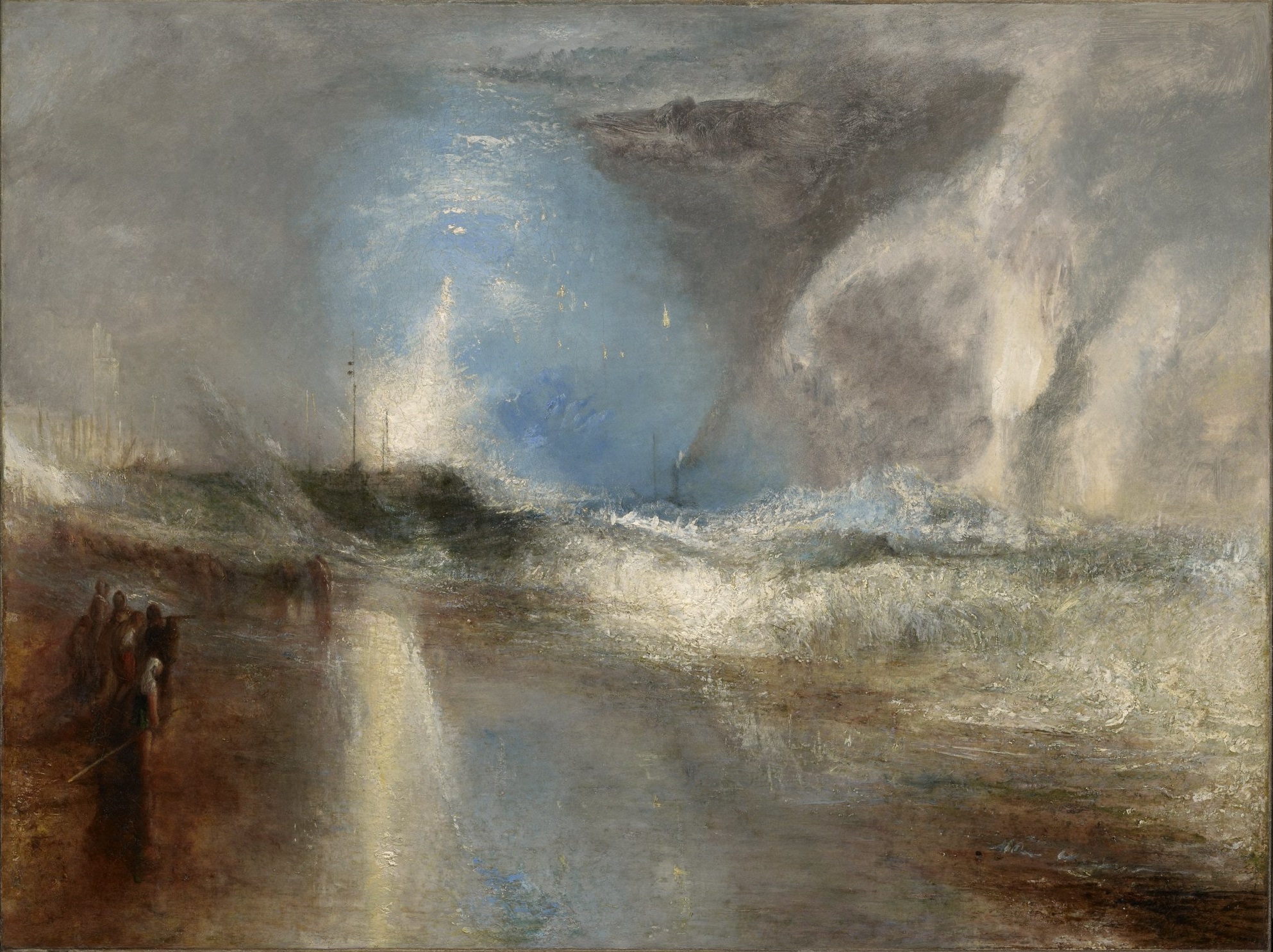
After doing a close look at Joseph Mallord William Turner’s painting, Rockets and Blue Lights (Close at Hand) to Warn Steamboats of Shoal Water (1840), I wanted to look into another piece by him. I decided to look at Rain, Steam, and Speed – The Great Western Railway to continue to see how Turner utilized light and contrasting colors to convey industrialization and nature. Like in class, Turner utilized blue, yellow, and whites to represent the sky and a rusty brown to show the influence of humans and black smoke to showcase the change of power as time went on and technology continued to develop. When looking at this image it shows the train coming towards the viewer while in the corner is a boat with two figures on it, one with an umbrella and the other holding the oar as they move across the river in the same direction as the train. With the two figures in the boat as a point of reference, as one’s eyes move to the right, waving figures are also visible on the train itself. Their light clothing standing out from the vegetation, red, blue and white being visible in the midground while little splotches on the train may also be intercepted as waving passengers as they pass by.
How I interpret the movement of this painting is that transportation is becoming more efficient and accessible to many people and both the boat and train are moving towards us in the present. At the time of painting, the artwork would be viewed by someone who is living during the Victorian era and Industrial Revolution. While the painting depicts movement of a train on the Maidenhead Railway Bridge located in Maidenhead, England it also shows how industrialization is also having an impact on the surrounding areas. The areas closer to the train take on a more dark tinge, while this is the aging varnish or intentional, it connects the Rockets and Blue Lights (Close at Hand) to Warn Steamboats of Shoal Water painting to Rain, Steam, and Speed — The Great Western Railway through showing a reddish brown dock and people on it and people becoming covered in a darker area, respectively. I also wanted to note that the rain almost creates a water color like feeling, the view is not perfect and almost blurry. A fine mist that was absent in Rockets and Blue Lights (Close at Hand) to Warn Steamboats of Shoal Water. Showing differences in weather through brush strokes, with over the bridge having hues of blue, similar to light beams coming through clouds, reinforces the existence of nature despite the construction of bridges and trains. I enjoyed learning about Turner’s artwork and I am curious to read more into it, an example being that I did not mention the three puffs of steam coming from the train’s smokestack, being one of the only sharp components of the painting. The bridge on the left is also defined as said, both being manmade while everything else has softer edges.
Overall, Turner’s interest in contemporary art and the industrial revolution can be seen from the two aforementioned paintings as well as nautical ships. Using light and brushstrokes allowed him to convey the weather and conditions that would come to make the painting come to life and create a dreamy representation of life.
Rockets and Blue Lights (Close at hand) to Warn Steamboats of Shoal Water by Joseph Mallord William Turner (1840)
Sources
Dr. Beth Harris and Dr. Steven Zucker, “J. M. W. Turner, Rain, Steam, and Speed — The Great Western Railway,” in Smarthistory, November 25, 2015, accessed December 8, 2025, https://smarthistory.org/j-m-w-turner-rain-steam-and-speed-the-great-western-railway/.
Joseph Mallord William Turner, Rain, Steam, and Speed — The Great Western Railway, oil on canvas, 1844 (National Gallery, London)
Joseph Mallord William Turner, Rockets and Blue Lights (Close at hand) to Warn Steamboats of Shoal Water, oil on canvas. 1840. (Clark Art Institute, Williamstown, Massachusetts)
Posted in Uncategorized | Tags: jmw-turner, Painting, turner, turner-and-nature
Stereographs: Viewing from the Home

Stereoscopic photographs first gained notoriety during the Great Exhibition of 1851 in London. Above is an example of one of the stereographs taken and circulated. Stereographs could be used to show events and foreign countries such as East and South East Asia. While “carte de visites” are visiting cards, stereographs were 3D photos one could observe through glasses to see the details of an image and step into the space for lack of a better term. This medium of photography allowed people to shift how far and close the photograph is to their face, giving them a new depth of field to look through as if they were in the space itself. This medium is still used today in the form of virtual reality classes. While it is more developed and one can move around in the display, unlike early stereographic images, it has the same principles of having a display and lenses to look through.
Stereographs were invented by Sir Charles Wheatstone in 1838 to create a three dimensional image through similar technology that is used in binoculars to create one image while isolating the eyes. Stereographs are slightly concave with, similar to binoculars, allow the image to appear 3D to the wearer. These mirrored photographs, using two identical photographs with the help of calotypes, are negatives that are images that are created though light exposure hitting paper treated with light sensitive chemicals and then developed in a dark room. I linked a blog, The Stereoscopy Blog, that goes into this process below if it is of interest to read.
The ability to create a 3D image is not something that is unfamiliar given 3D glasses, virtual reality, and cameras who take a 360 view of its surroundings to help place one in the location of interest. The stereoscopes allowed people to use the holders and stereographs to be reminded of their travels, either foreign or local but inaccessible to travel to. Or, fleeting events and exhibitions in the case of the Great Exhibition of 1851. The image attached is only an example of stereographs taken during the time the Crystal Palace was constructed. Most photographs I have seen have a vanishing point, allowing the viewer to have a depth of field. When one brings the image closer to the eye they can make an illusion of stepping into the photograph. Below is another example in a different section of the venue.
Carte de visites and stereographs became mediums that allowed people to sit in the comfort of their own home and take a look or snapshot into another place. Those who could afford it were able to travel to these destinations and bring back their own souvenirs in the form of photographs while those who did not have the means to travel and take photographs relied on others. Studios were set up in locations of which became popular for tourists and later evolved into postcards for people to send to loved ones or to take back with them for their travels. It was also the exhibition that made stereographs become more popular after about twenty years since its invention. A memory of seeing the inventions and marvels of the human mind, through another innovative creation through combining the binocular effect with photographs.
Like photography, stereographic images have evolved to become deeply ingrained in technology and continue to become more sophisticated as humans try to replicate reality through manmade means, either through computer generated images or digital means.
This video goes into how stereographs work. https://youtu.be/8Oq_9lFvRf0?si=hiqFL8O9kCH4OjWW
Works cited
“Charles Wheatstone: The Father of 3D and Virtual Reality Technology.” Feature from King’s College London, 28 Oct. 2016, http://www.kcl.ac.uk/charles-wheatstone-the-father-of-3d-and-virtual-reality-technology-2.
Rebecca. “Making a Stereoscopic (3-D) Calotype at Lacock Abbey, with Jo Gane and Robert Douglas.” The Stereoscopy Blog, 23 Oct. 2025, stereoscopy.blog/2025/10/19/making-a-stereoscopic-calotype/.
Unknown. “View in the nave at the 1862 Great Exhibition.” Victoria and Albert Museum Collections, 18 March 2009, https://collections.vam.ac.uk/item/O201565/a-view-of-a-great-photograph-london-stereoscopic-company/
“Victorian Stereoscope: The Village at Black Creek.” Village at Black Creek, 4 Feb. 2025, blackcreek.ca/exhibits/out-of-the-box-exploring-artifacts/stereoscope/.
Williams, Thomas Richard. “’The Two Colossal Statues’ at Crystal Palace.” Victoria and Albert Museum Collections. 30 June 2009, https://collections.vam.ac.uk/item/O1076224/the-two-colossal-statues-at-photograph-t-r-williams/
Posted in Uncategorized | Tags: photography, stereographs, stereoscopic-photography, victorian-photographs
