In 2001, Frédéric Brochet, Gil Morrot, and Denis Dubordieu published their now-famous study indicating that visual perceptions of color played a much larger role in odor and taste perception than previously thought. Brochet and Dubourdieu found that when sommeliers were given a glass of white wine with a red odorless dye added, they tended to incorrectly identify it as red wine, using significantly more terminology typically used to describe red wine than white wine (Brochet et al., 4). A similar study conducted six years later by JoAndrea Hoegg and Joseph W. Alba found that people perceived a great difference in taste between orange juices dyed varying shades of orange than they did between juices with added or reduced sweetness (Hoegg et al., 496). These studies demonstrate the great influence that visual perception has on taste. Since the rise of industrialized and mass-produced foods in the late nineteenth and early twentieth centuries, food and advertising industries have taken advantage of this psychological phenomenon to maximize profit, permanently changing widespread ideas about the categories of “natural” and “constructed” in the process.
As food packaging became more and more common, consumers were forced to rely less on previous methods for determining readiness, such as touch and smell, and instead find visual cues to indicate which food they should purchase. By 1870, companies such as Louis Prang & Company and Currier & Ives were printing brightly colored images to be packaged with food products and distributed in stores (Hisano, 19). These images, three of which are shown here, have a clear message: the best fruits are perfectly round and plump with a bright and even color. Some, such as the currents, are shown outdoors, surrounded by their growing counterparts, situating these perfect berries as perfectly natural, pulled from the bush and directly placed on the store shelves. With innovations in packaging and shipping technology, many of the fruits and vegetables now being sold were new to British and American consumers, so they had to trust what these advertisements told them their food was supposed to look like (Hisano, 19).


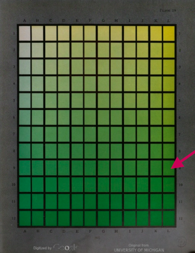
The problem, however, with relying on visuals like this so much is that everyone perceives color differently. Later, searching for a way to standardize color, businesses and members of the food industry adopted existing categorizations of color for their purposes. One system that was widely used in the food industry (and remains in use today) is the Munsell color system, originated in 1905 by Albert H. Munsell with the intent of teaching color to children (Hisano, 23). In 1930, scientists Aloys Joh Maerz and Morris Rea Paul published A Dictionary of Color, the largest collection of categorized colors at the time with 7,056 different shades (Hisano, 25). The U.S Department of Agriculture (USDA) used A Dictionary of Color to set standards for canned fruits and vegetables. For example, frozen peas lighter than “L-9” on Plate 19 (shown with the red arrow below) could not be graded above US Grade B (Hisano, 25).
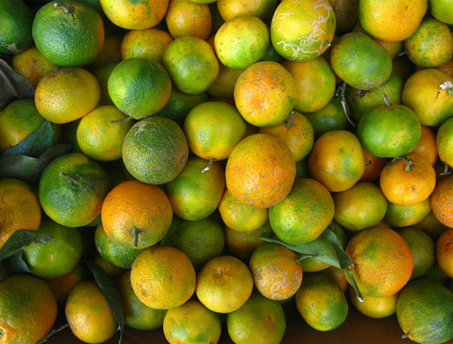
Color standardization became a marker for the value of food — the more uniform a farmers’ crop was, the more they could sell that crop for. To ensure their profits, farmers and growers turned to new technologies. Oranges, for example, were not always orange. Ripe oranges grown in tropical areas, such as Florida, are much less orange than those grown in subtropical climates, such as California. Because of widespread marketing efforts by California growers, the ripe orange was the perfectly round, bright orange color on packaging and advertisements. Florida oranges, with their splotchy green patches, simply weren’t as desirable to consumers. In an attempt to rehabilitate the image of the Florida orange, growers put out marketing material advocating for choosing citrus fruits by feel rather than looks (Graber and Twilley). Florida oranges, they stated, had the most juice, making them better and heavier than California oranges. This, however, was a failed effort. The visual culture of food uniformity was too established to change, so Florida growers changed their oranges to fit in, dying the peels bright orange to match the more profitable California ones (Graber and Twilley). Because they are not altering the food itself — just the skin — this practice is legal as long as the fruits are labeled as dyed. The FDA states, “historically it has been the policy of the Food and Drug Administration to allow the artificial coloring of the skins of mature oranges” (FDA).
Works Cited
Brochet, Frederic, et al. “The Color of Odors.” Brain and Language, vol. 79, no. 2, 2001, pp.309–320., doi:10.1006/brln.2001.2493.
Graber, Cynthia, and Nicola Twilley. “Eating The Rainbow: Or, The Mystery Of The Orange Oranges, The Red M&Ms, And The Blue Raspberry”. Gastropod, 2020, https://gastropod.com/eating-the-rainbow-or-the-mystery-of-the-orange-oranges-the-red-mms-and-the-blue-raspberry/.
Hisano, Ai. Visualizing Taste: How Business Changed the Look of What You Eat. N.p., Harvard University Press, 2019.
Hoegg, JoAndrea, et al. “Taste Perception: More than Meets the Tongue.” Journal of Consumer Research, vol. 33, no. 4, 2007, pp. 490–498. JSTOR, www.jstor.org/stable/10.1086/510222.
FDA, Office of Regulatory Affairs. “CPG Sec 550.625 Oranges – Artificial Coloring.” U.S. Food and Drug Administration, FDA, http://www.fda.gov/regulatory-information/search-fda-guidance-documents/cpg-sec-550625-oranges-artificial-coloring.

Hi Vincent,
The study of advertising and food is absolutely fascinating, thank you for sharing! I had heard previously about the green coloring of oranges before, but I never realized the full story. Knowing that the coloring process centers around Florida oranges in particular is interesting, since to me at least that is the one place I associate oranges with at all – probably because of advertising. The fact it was the Floridian oranges that initially suffered is strange to know, even more so that they tried and failed to change public perception of what makes a good orange – which is not actually being orange!
This discussion of food advertisements and colors reminds me of the colors used in restaurant advertising. If I recall correctly, the story goes is that since red is believed to be associated with hunger, many, many restaurants use red in their imagery. This isn’t related to the food itself, but can be seen with places like McDonald’s, Friendly’s, Dairy Queen, and I’m sure much more. It makes me wonder if at this point, it is a learned human instinct because of all these restaurants feature red rather than the other way around. It is like the situation with the oranges you mentioned at the beginning of your post – people tend to associate different shades of orange with the flavor of orange juice, even though the fruit used may have been a different color to begin with.
By: lindseymhc on December 14, 2020
at 9:58 pm