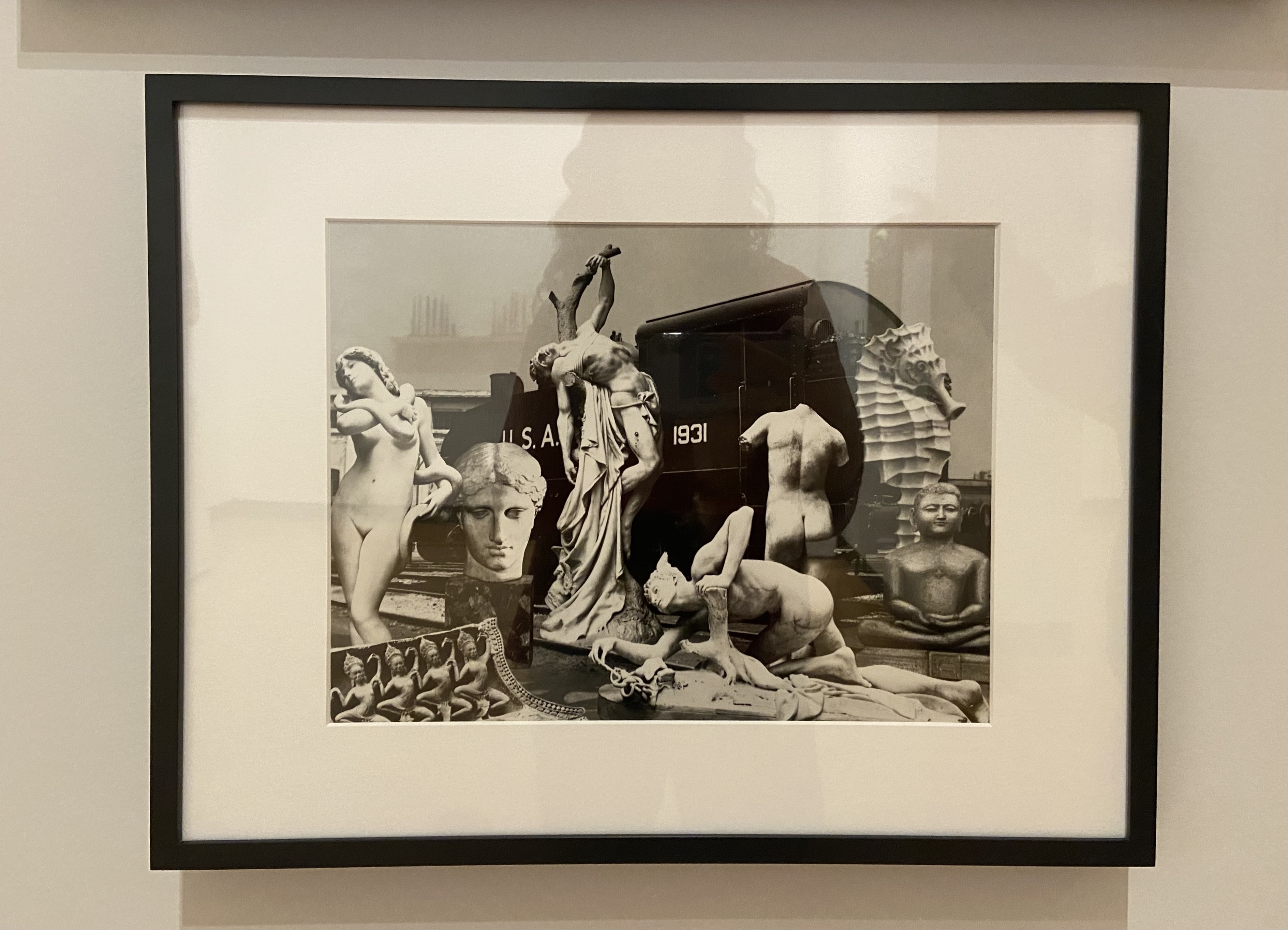
Making my way around the exhibition “Art of the 20th and 21st Centuries Reimagined” in the MHC art museum, one piece in particular stood out to me: City of New Orleans by Jane Hammond, class of 1972. This piece is a collage done completely in black and white, depicting a variety of ancient sculpture in the form of “human divine, and aquatic bodies” (City of New Orleans). Behind the “overlapping” bodies appears to be an old freight train car, hardly the scenery where one would expect to see this combination of greek statues, statues of the Buddha, and one large seahorse statue, if there is a scenery in which to expect it at all (City of New Orleans).
The absurdity and surrealism of this work took me back to one of my favorite portions of the class, where we looked at the Victorian photocollage. Peaking in the 1860s and 1870s, photocollage was a common pastime for aristocratic Victorian women, involving the marriage of photography and painting. While Hammond’s work contains no element of drawing or painting, her work is reminiscent of the photocollage in its use of found materials, wacky scale, and desire to represent an understanding of femininity.
In her book Playing with Pictures: The Art of Victorian Photocollage, Elizabeth Siegel writes that photocollage makers “combined the facts of photography with the fictions of painting” to create “a new kind of representation” (32). This format “allowed–even encouraged–” Victorian women “to expand the limitations of photography to incorporate fantasy, dreamscapes, whimsy, and humor” (Siegel 32).
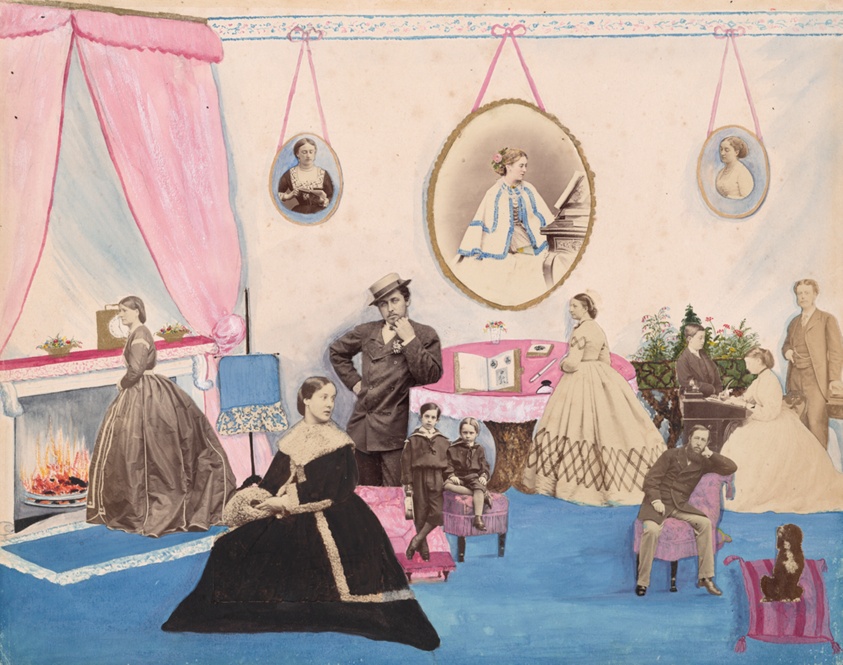
Mary Georgiana Caroline, Lady Filmer. From the Filmer Album, mid-1860s. Accessed here.
In the photocollage above, we find twelve separate portraits that have been rearranged into a parlor room scene. Their inconsistent size lends itself to a sense of playfulness. Seven of the twelve images depict women, so while they dominate the scene in terms of numbers, not a single one looks straight ahead; her face is always turned towards some unseen interest (aside from the two women who peer down at desks). Six male figures are included in the scene, though they are generally much smaller than the women. Their gazes, however (with one exception), are all directed towards the viewer. Perhaps Lady Filmer wishes to communicate that although aristocratic women were largely responsible for the Victorian social scene, the way she “staged her family’s social position, marked her gentility and taste, and displayed her connections” was not seen as work, and she was therefore not supposed to desire recognition for the labor she performed.
Hammond sees the meaning of her work as “fluid and multiple,” an attitude that can be gauged from the androgyny/genderlessness of all the figures she chose to include in her work (City of New Orleans). Here, we experience a range of subjects’ sizes, but the effect is more unsettling than playful. These figures appear vulnerable and/or to be in states of distress between their general nakedness and dramatic arches and bends of their bodies to convey emotion (rather than their faces, which are oddly blank). The only figure that is obviously a woman draws the eye’s attention for this reason. Her body is almost completely visible, not wrapped in cloth or shadowed by severe movement. Only a snake slithers around her shoulders, rendering her as the biblical Eve. Thus, this statue still communicates a tragedy in its implication that Eve is in the process of being tempted to eat the forbidden fruit. Posed against an object of modern industry, we are forced to confront how this image, and the associated story, as well as all the other icons in the work, stand the test of time. Perhaps Hammond also uses this piece as a space to mourn the loss of sculpture as a popular art form.
I am left thinking of the following explanation from art historian Geoffrey Batchen: “As with all collage practices, attention is drawn to the edges of each page’s constituent images, disrupting the realism of the photographs and locating them in the here and now of the page itself” (32). I find so much pleasure in studying collages because there are so many images to be picked apart, and what they mean individually is not indication of what they mean all together.
Works Cited
Filmer, Mary Georgina. Lady Filmer in Her Drawing Room, The Filmer Album, mid 1860s, The Art Institute of Chicago.
Hammond, Jane. City of New Orleans, 2007/2009, The Mount Holyoke College Art Museum.
Siegel, Elizabeth. Playing with Pictures: The Art of Victorian Photocollage. The Art Institute of Chicago, 2009.
In the 21st century, it is nearly impossible to imagine going through a day without using soap in some capacity. We use one kind of soap on our faces, another on our hands, a third on our bodies and a fourth on our hair. Then there is the soap for our dishes and the soap for our laundry. And within these categories, there are different products available depending on what outcome you might be looking for: face wash with age prevention abilities; shampoo that gives you soft and silky hair; or dish soap that will give your cutlery an apple blossom-scent.
In her video essay “THE CULT OF CLEANLINESS,” YouTuber Mina Le argues that “we’re getting a little too obsessed with…cleanliness and fragrance, and most of it is because of marketers” (20:52). Evidence to support this claim is found easily in the body wash aisle. Brands like Dove and Method recently developed lines intended specifically for men (and here I was, thinking everyone could enjoy scents like lavender, citrus, or coconut). Aside from more muted packaging and more nonchalant, “tough,” and “conceptual” scents (e.g. “charcoal and clay;” “sea and surf;” “glacier and granite”), they are still, at the end of the day, just soap. The way certain personal hygiene brands now pander to men as an offshoot of their regular products begs the question, were men not cleaning themselves before Dove Men+Care or Method Men hit the shelves?
While I do support a regular washing routine, I find it compelling to investigate how such an expectation came about. Personal “cleaning rituals” were not the norm until “a few decades” into the nineteenth century (McClintock 207-208). But once the process for creating soap became simpler, the item became a staple of imperial commerce as well as evidence of “Britain’s evolutionary superiority” (McClintock 207-208). Soap was marketed not only as a physical cleanser but as a moral purifier, and Victorians came to associate cleanliness as the mark of civilization. An 1890 advertisement for Pears’ Soap is one of the most salient examples of this strategy and mentality. The notice depicts a person of color, stylized as indigenous, discovering a box of Pears’ soap that has just washed ashore. Above the image reads “The Birth of Civilization–A Message from the Sea.” This advertisement clearly operates under a colonial logic that asserts cleanliness as superior and seeks to impose this value onto whichever nations are able to be subjugated. Under the image, the sentiment continues: “The consumption of soap is a measure of the wealth, civilisation, health, and purity of the people.” This assertion reminded me of a line from the 1928 book A Tale of Soap and Water: The Historical Progress of Cleanliness, which Le mentions in her video. The book explains that “Most of us want the good and beautiful and worthwhile things of life. Soap and water alone cannot give them to us, but we know that they help” (19:49). Grandiose claims about the powers of soap did not stop at the turn of the century. In fact, the connection between personal hygiene products and wealth/purity has only intensified in our modern day internet-obsessed culture (more on that later).
Victorian soap advertisements are early iterations of how the hygiene industry’s marketing “disproportionately targets women” (21:15). An 1898 advertisement for Watson’s Matchless Cleanser depicts a line of women in maid’s uniforms carrying baskets of the cleanser; the line is neverending, stretching all the way back until the sun meets the horizon. Throughout the iconography presented in this poster we encounter the narrative that it is a woman’s duty to clean and to be clean. The silhouette of the maid’s uniforms is consistent with fashionable styles at the time–if it were ever required by an employer, they would be an extremely wealthy one. Furthermore, a maid in this type of dress would likely perform more “front-of-house” duties like greeting guests, tidying living areas, and serving refreshments, rather than being down on her hands and knees scrubbing away at the floor. This advertisement then suggests that even if you are a middle-class woman who does her own cleaning, buying this soap will at least partially align you with the behaviors of a higher class. The image of a rising sun conveys ideas of beginnings: the start of the work day; the dawn of time. This suggests a continuous cycle of women working for the service of others, and that this position is where they belong, underscored by the uncanny alacrity with which the maids approach labor.
In class, we considered whether women having agency in purchasing/women being the subject of advertising is empowering. I find it hard to answer “yes” when I look at how the discourse surrounding hygiene has developed on the internet, especially TikTok. Anne McClintock opines that, with the commodification of soap during the Victorian period, the product was imbued with “magical, fetish powers” (207-208). I concur and argue that nothing has changed. An online space that fosters the development of micro-trends and niche appearance-based fixations, TikTok peddles products through a sort of virtual word-of-mouth, sponsored content, and–their most recent addition–TikTok shop. In my experience on the app, hygiene products (e.g. soaps, perfumes, lotions, skincare products) are marketed heavily. While TikTok is infamous for its hyper-sensitive algorithm and hyper-unique “For You” page, it has also become, in part, a space for commerce–no matter which “side” of TikTok you’re on.
One of the longest-lasting trends on the app is the “clean girl aesthetic.” First gaining popularity in 2021, the look is now easily identifiable, with staples such as “slick back” hairstyles, minimal makeup, stacks of gold jewelry, a fresh manicure, and clothing that is muted in both color and pattern. However, the aesthetic is most often seen on young, skinny, white girls who don’t outwardly say that they’re rich–but that’s because they don’t have to. So much of the clean girl aesthetic is wrapped up in buying, whether that be hundred-dollar skin care and thousand-dollar jewelry (mixed with Amazon jewelry to demonstrate humility, of course) or facets of the associated lifestyle, like pilates classes and $8 matcha lattes. In the videos above, both women list off the things you should do (buy) if you want to participate in the aesthetic. At one point @0emmamac introduces one of the clean girl requirements (having a fresh set of nails) by saying “This one’s super expensive and not everybody can do it,” a rare acknowledgment of how much the aesthetic relies on an extremely comfortable financial status. As explained by Averyl Gaylor of The Conversation, part of the allure of the clean girl aesthetic is the implication that “not everyone has the capacity to be a clean girl.” This exclusivity reflects the inextricable historical link between modern hygiene, race, class, and gender that this piece has sought to understand.
P.S.
One of the cornerstones of coming across as a clean girl is “smelling good” according to @0emmamac. Even beyond the clean girl aesthetic, there are creators on TikTok relaying their shower routines to any woman who wants to “smell amazing.” These videos typically emphasize double-cleansing the body and layering a minimum of three scented products onto your skin during/afterwards. Comments on the second of these two videos include “Why is everyone so rich lol” (@risshow_14) and “Definitely not poor girl friendly” (@livinitupliv).
The other creator whose instructional video I attached, @camreesec, even says that “clean girl aesthetic is not like, how clean you are, it’s basically, you look clean, if that makes sense.” It probably shouldn’t make sense, but as my roommate said when I explained the online jargon of the video to her, “Crazy how if I were to see that video, I wouldn’t bat an eye at any of the language.” Because there is the (mostly) unspoken rule that clean girls are rich girls and vice versa, @camreesec’s comment, weirdly, does make sense.
I want to end with a video by the creator @labyrinthave, who explains how the clean girl aesthetic is actually the result of white women co-opting the styles of black and brown women. She critiques the trend, arguing that,“brown people have always been seen as dirty, but when a white girl does it, it’s suddenly a trend.” While it is easy to look at the Pears’ Soap “Birth of civilization” ad as something offensive but far-removed from our culture, we must maintain a critical eye when it comes to what is marketed to us, whether that be traditional print or online influencers, because the connotations between cleanliness and civilization persist, just in (slightly) more covert ways.
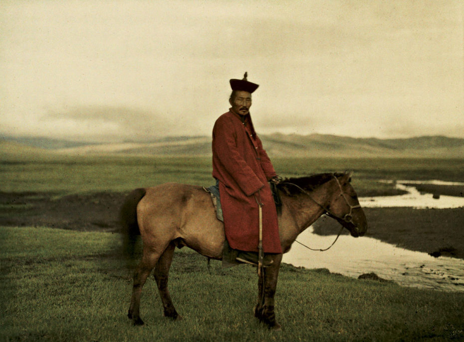
In the early 1900s, the Lumiere brothers (likely a familiar name due to their influence on cinema) invented an early form of color photography. The science behind it was complex and it was certainly not convenient to produce the plates necessary to take photos in color, but the effect is astonishing even to modern eyes. I recall the first time I encountered an autochrome photograph while looking through images of Edwardian fashion; at the time, I was ignorant to the existence of early color photography and it was unlike anything I had seen from the period. The effect of autochrome is much dreamier than anything our modern processes of colorizing antique photos can achieve, so my interest was immediately piqued. They’re ethereal and luminescent in a way that would now be quite hard to replicate without digital filtering, which gives them a special quality.
I initially began looking into autochromes as a research resource for studying dress history; there’s something so very intriguing about getting to look at the real colors of garments we usually can only see 1) in black and white or 2) in their current 100+ year old state. But all manner of subjects were captured with this technology, as it required no special device and could be used with regular cameras.
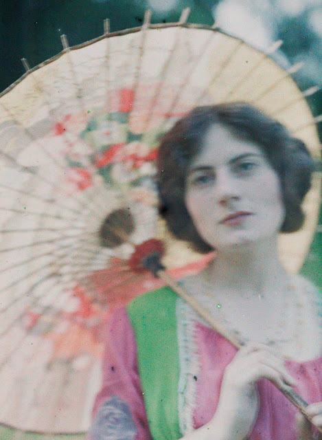
The above photo is one of my favorite fashion-related autochromes I found while I was initially using them for fashion research. It’s simple, and not particularly artistically notable, but it is so natural and casually taken that I could easily be fooled this is a modern woman dressing in period attire. In these cases, I certainly understand the claim to the “real” that people felt photography had, as I feel almost as though I’m there, looking in at a scene more than a century ago.
These autochromes by John Cimon Warburg display the beautiful hues captured by the technology. The simultaneously muted and lurid colors are stunning, and — literally! — recolor the way we envision the Edwardian era. Below is an image of an autochrome diascope viewer to give an idea of how people could look at these images, since they are now so rarely exhibited due to their sensitivity.
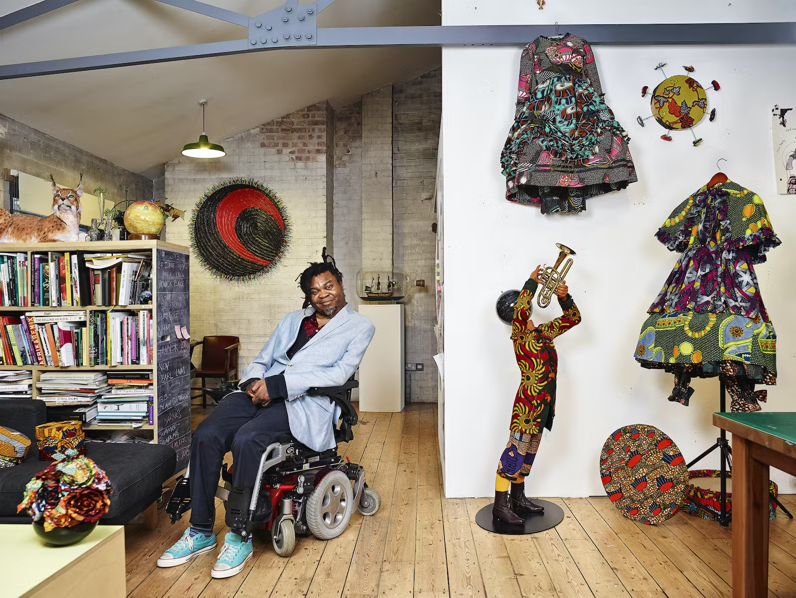
I was first introduced to Yinka Shonibare’s work when I saw his piece Gay Victorians (pictured below) in the San Francisco Museum of Modern Art a few years back. The patterns and bright colors of the fabric caught my eye. The fabric he uses in this work, and many of his others, is a cotton with an Indonesian batik design. Often seen in West African fashion, this fabric was first introduced to Africa by a Dutch company through colonization. It can also be found in London markets, which is where Shonibare buys it. Just the fabric itself has a complex history which is deeply entwined with European colonization of Africa and the movement of goods which helped to fund it. The dresses are made in the bustled silhouette of the 1880s. They’re beautiful to see in person, especially the way the patterns and crispness of the cotton interacts with the many layers of the skirts.
Gay Victorians, 1999, San Francisco MoMA.
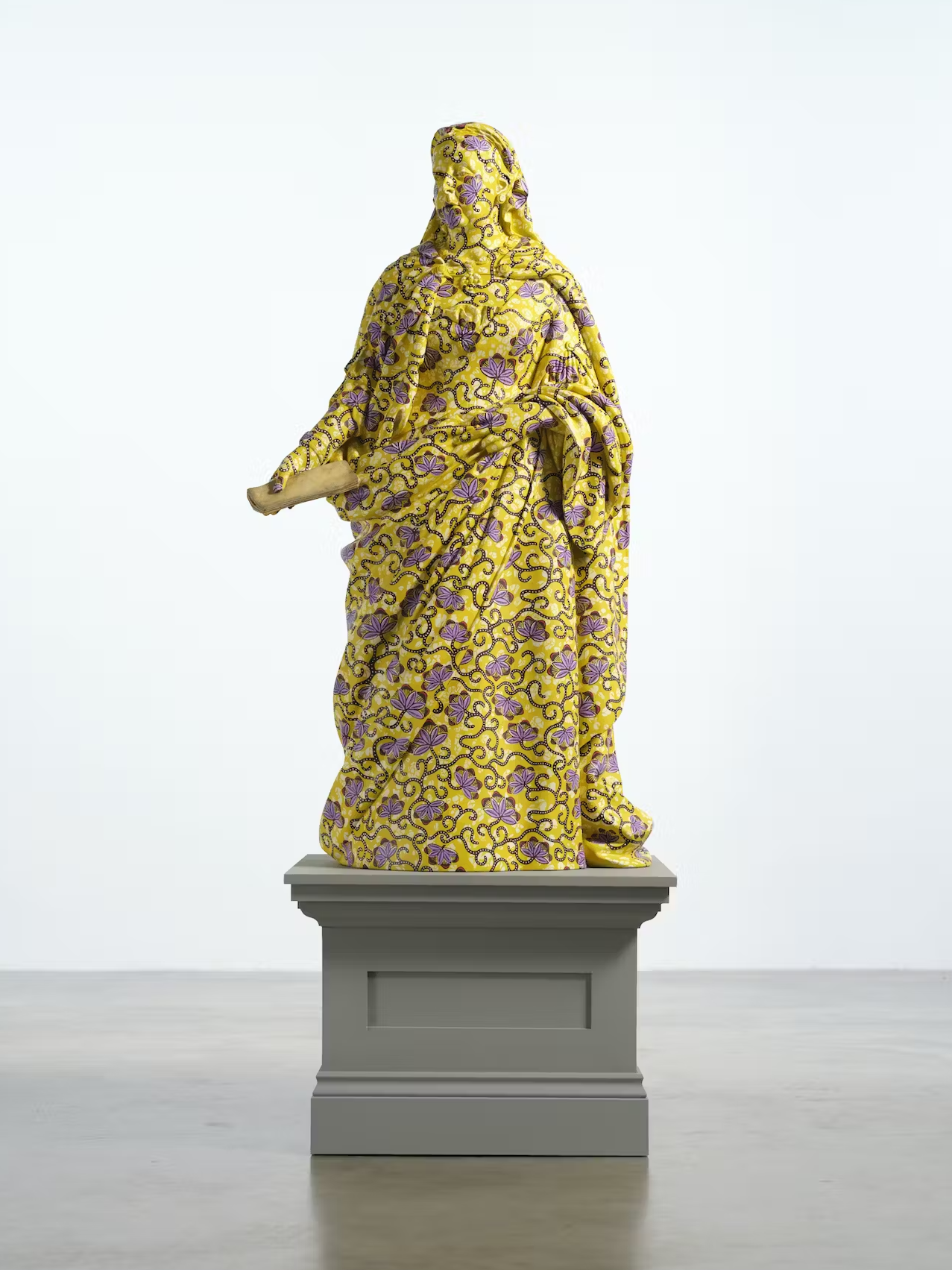
Looking further into Shonibare’s work online, another piece caught my eye. Decolonised Structures (Queen Victoria) is from his larger Decolonised Structures series, which was created last year. This time, a batik pattern has been painted onto the surface of a statue of Queen Victoria. By covering the entire surface with the pattern, without delineating skin or clothing, the statue’s features are obscured. While the goal of this statue would have previously been recognition of the image and status of Queen Victoria, it now resists readability. It can no longer function as a status symbol without first wading through the history of colonization that the batik pattern represents.
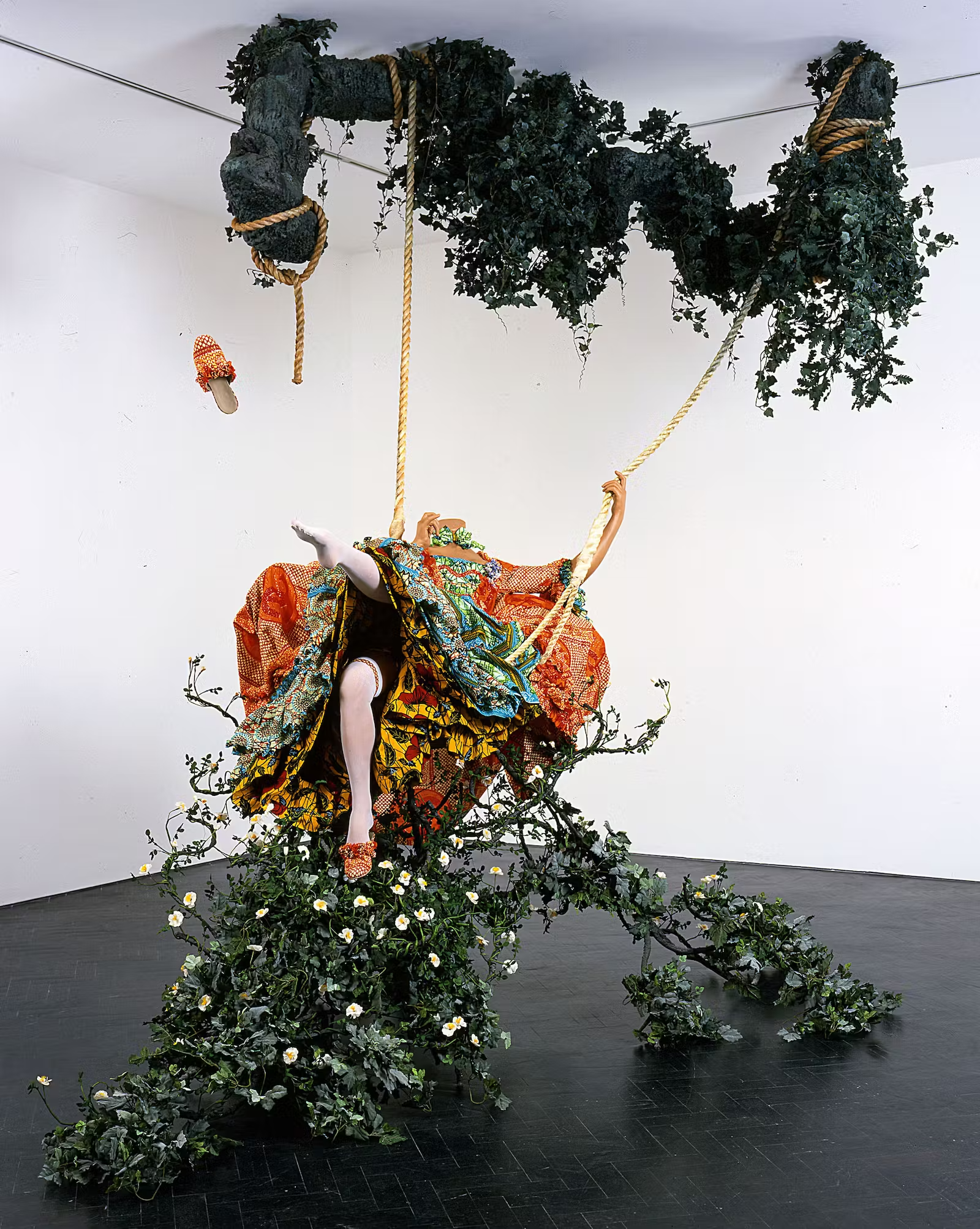
Other pieces of Shonibare’s work continue to play with recognizable figures. One of my personal favorites is his recreation of Fragonard’s The Swing. It’s incredible how well he’s able to capture midair movement in a still, three-dimensional sculpture. The viewer becomes a part of the iconic painting and allowed a shifting view of a scene that, for so long, has only been viewed from one angle. Much like Gay Victorians, the headless mannequin shifts the focus to the posing and costuming, rather than allowing the viewer to only pay attention to the face. The installation of the piece in the room itself makes it seem like it is growing out into the space. The pose of the figure in the original painting has been captured so precisely yet completely re-contextualized and transformed by Shonibare.
The Swing (after Fragonard), 2001, courtesy of Tate.
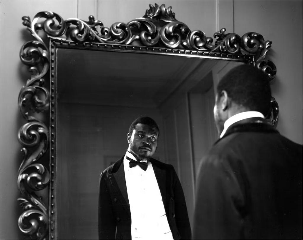
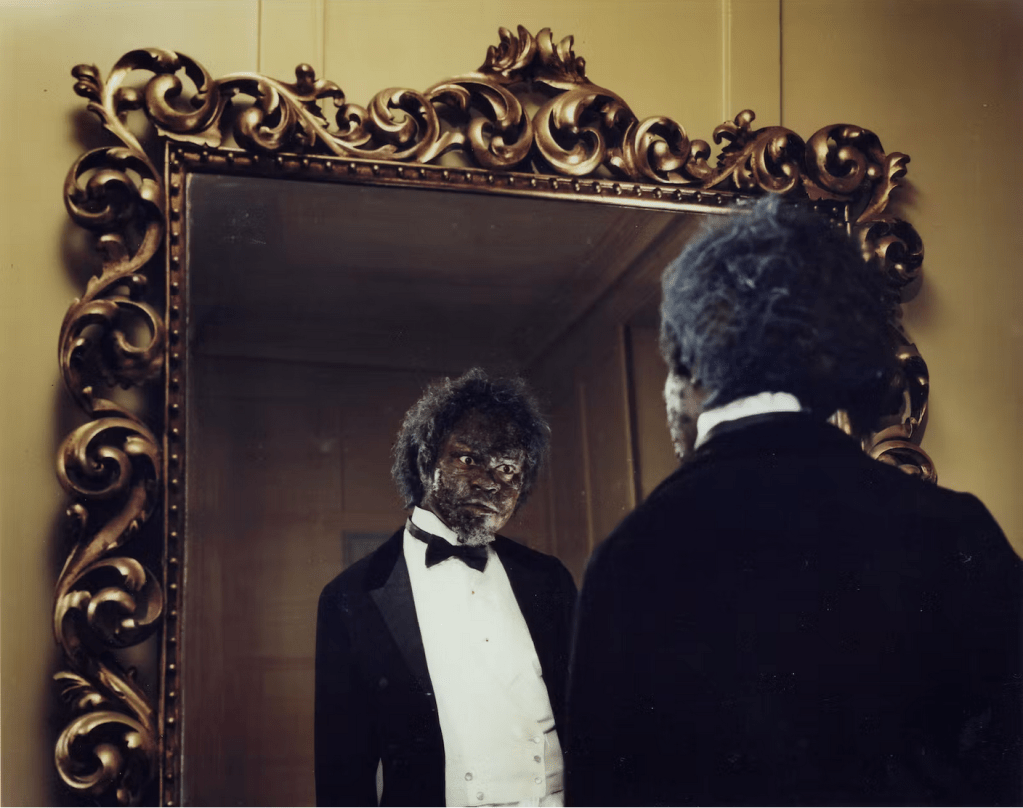
I’ve included one more of his works below, since it’s especially relevant to this course’s material. Dorian Gray is a collection of 12 photographic prints in the style of film stills made in 2001. Key scenes from the original novel are recreated in black and white. When collected together, the use of color when Dorian looks at his changed face in the mirror is striking.
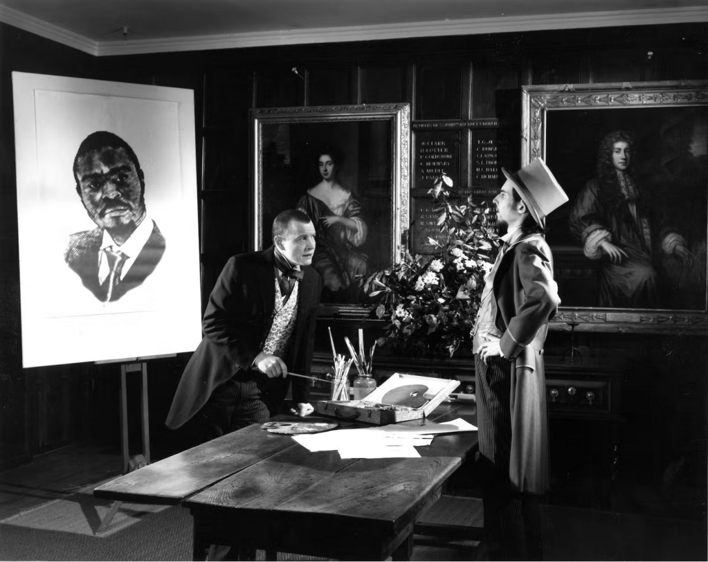
Shonibare’s work ranges across many mediums, each requiring their own complete skill set. His work with textiles, sculpture, paint, and photography are all excellently done. I haven’t even touched on his large scale metalwork installations or filmography. It’s very impressive that he’s able to produce varied and well-made art within so many mediums, while each individual piece is still stylistically recognizable as his.
Yinka Shonibare CBE RA in his studio. Photo by James Mollison, 2014.
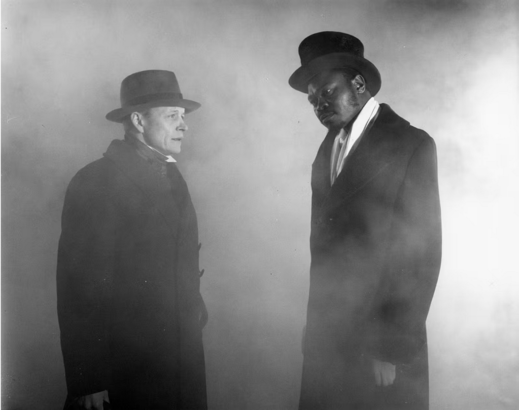
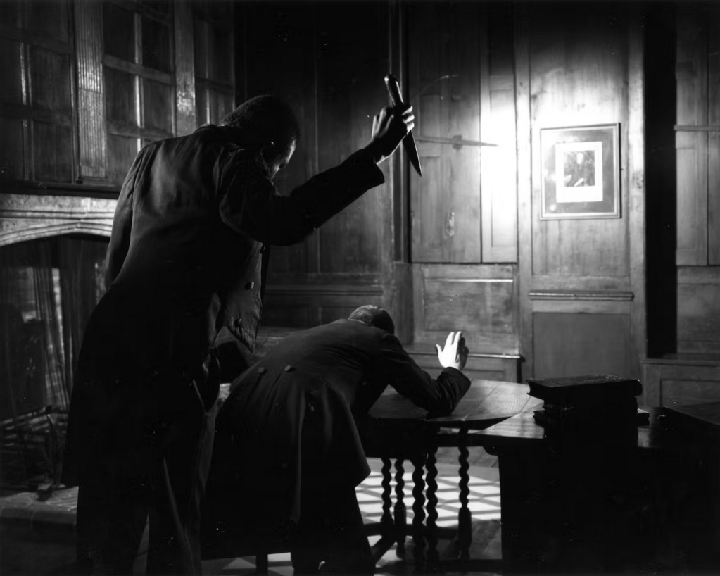
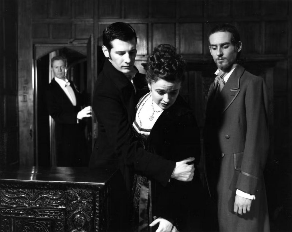
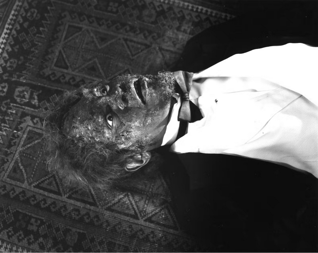
I’ve spent a while going on about the costuming of Guillermo del Toro’s 2015 film Crimson Peakhere, but would like to elaborate further on some of the film’s content that intrigues me, beyond the visuals. I’ve long been fascinated with the ways Victorian literature can break down the family structure or turn that site of safety to one of danger and insecurity. Our discussions of the domestic and motherhood this semester have certainly been in the back of my mind while thinking abut the film, as it is so concerned with domestic horror and tragedy. We’ve encountered many examples depicting the consequences of that domestic breakdown, and Crimson Peak is an interesting one as we see the same ideas addressed by modern creatives, then filtered through a Victorian lens. In the film, the family home is the center of the danger and horror; it is where the violence that begets infinitely more violence begins, in a Wuthering Heights sort of fashion. Even before arriving at the (appropriately!) ominously named Crimson Peak, the protagonist Edith’s first tragedy — and encounter with the supernatural — takes place after the death of her mother, an event that remains ever-significant to her navigation of the distorted domestic sphere of the Sharpe family home, Allerdale Hall.
The breakdown of family structure is so severe there that it transforms Thomas and Lucille Sharpe from mistreated children to the perpetrators of violence. The family structure is continuously distorted through the film, seen in the Sharpes’ repeated acquisition of wives for Thomas (always murdered shortly thereafter), or the incestuous relationship between the siblings brought about as a byproduct of severe abuse and neglect in their childhood.
The fate that eventually befalls the rest of their family is a grotesque sort of reckoning for the traumas the children suffered at their hands. After that initial breakdown in their developmental years, they (and especially Lucille) adapt to life poorly and exist almost as specters, driven by their pasts and unable to escape the site of their tragedy. It’s fascinating to examine a character like Lucille in this modern gothic tale; she recalls Bertha Mason (of Jane Eyre) — a madwoman, initially confined, though she escapes confinement to an attic or institution and returns to the family home which becomes her domain, though it entraps her in a different sense. So there is something of Heathcliff (of Wuthering Heights) in the way that she threateningly moves through and controls the collapsed domestic sphere, bound to endless cycles of violence, unwilling or unequipped to escape them. The film is a lovely and disturbing collage of these Victorian recollections, remade into a newly distorted domesticity.
Thanks for reading!
Works Cited
Crimson Peak. Directed by Guillermo del Toro, Universal Pictures, 2015.
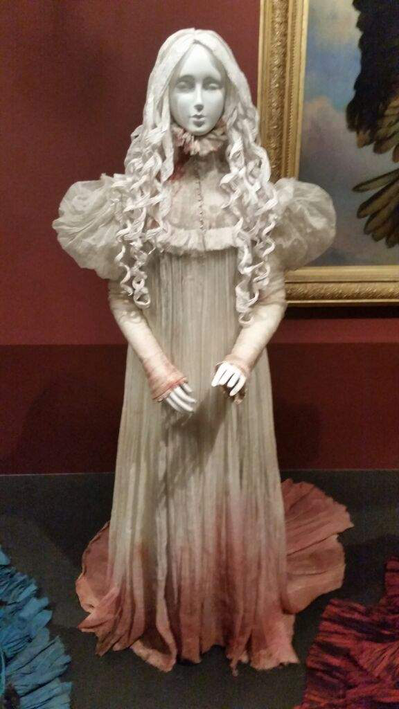
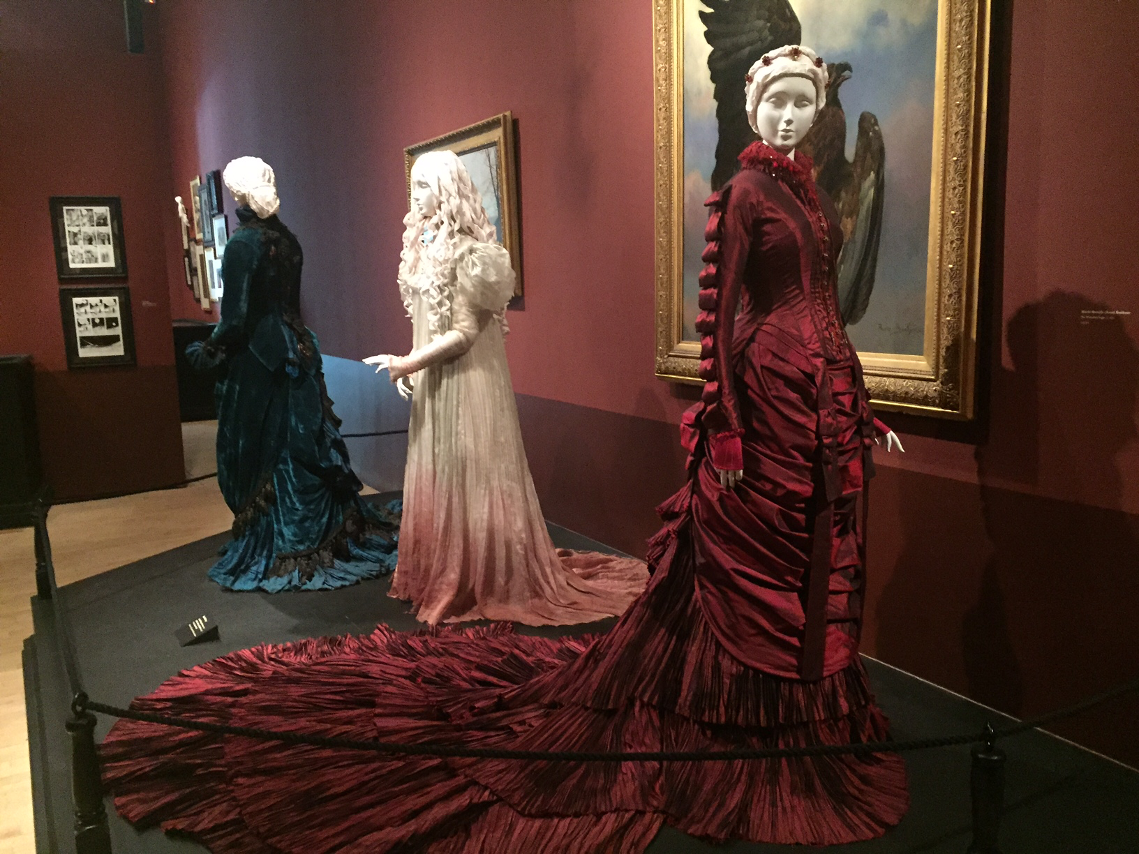
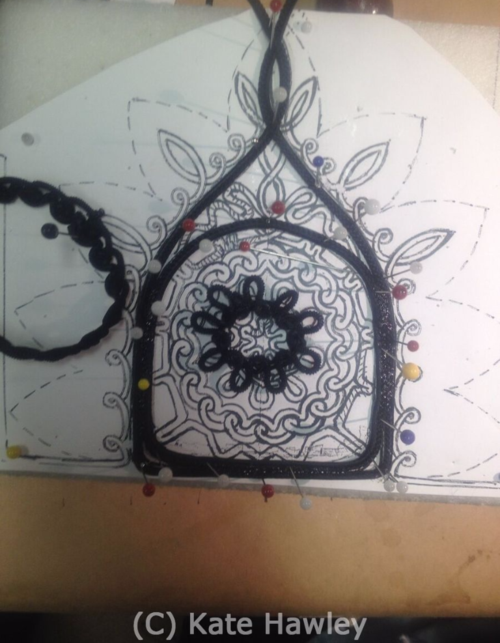
Crimson Peak costumes at the FIDM, designed by Kate Hawley.
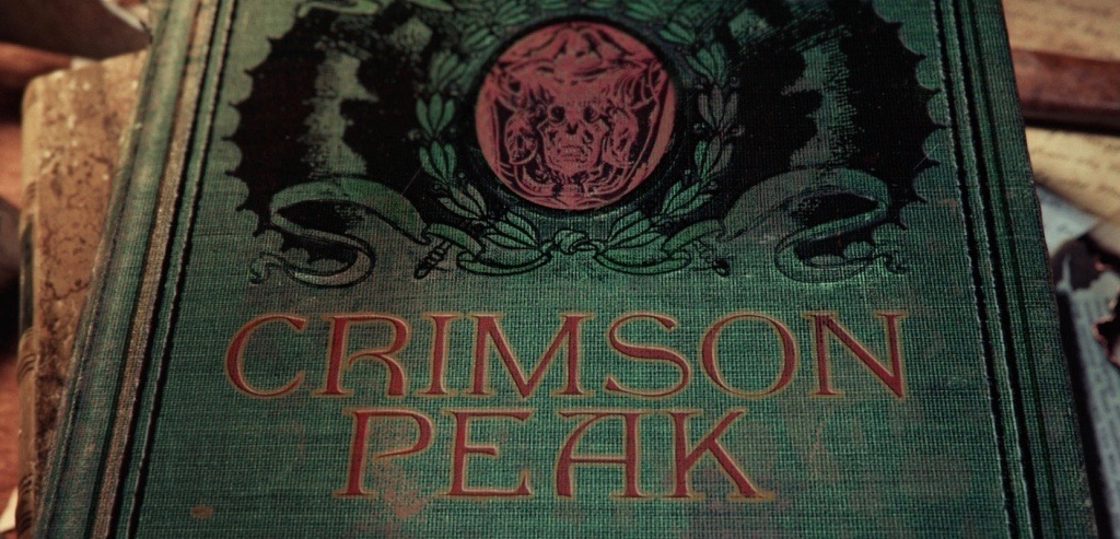
One of my favorite films is Guillermo del Toro’s Crimson Peak, a love letter of sorts to the gothic romance genre, and the Victorian gothic in general. The film’s costumes have been exhibited on several different occasions at various places, so I’ll be discussing the costumes broadly, as well as the insights into the process that some of the displays include. I’ve sourced my images from the following exhibits: the Fashion Institute of Design & Merchandising Museum, 2016, and the Art Gallery of Ontario (& other locations) where a larger Guillermo Del Toro exhibit happened in 2017-18. Also, a fun fact I’ve been sitting on for a while: Del Toro refers to his second home where he keeps his extensive collection of horror paraphernalia as “Bleak House” after the Dickens novel.
Spoilers interspersed below — beware!
Additional costumes shown in the Guillermo Del Toro: At Home With Monsters exhibit at the AGO. Left to right, Lucille Sharpe’s “drop of blood” dress, Edith Cushing’s nightgown, the ghost of Edith’s mother, the same dresses of Lucille and Edith pictured again.
Some brief background on the film: It follows the bright (in both mind and color scheme) Edith Cushing, an American woman and aspiring writer. She is pulled into the dim and dangerous world of the Sharpe siblings, the very last of a crumbling line of minor aristocrats. There are, of course, ghosts, murder, and dark traumatic pasts abound. It is set at the very cusp of the Victorian and Edwardian eras, and straddles the line between the archaic and modern in its characters, narrative, and visual associations. The film plays deliberately with the themes, tropes, and images associated with the era, relying on not just a historical familiarity with the Victorians but a cultural familiarity/knowledge of our modern engagement with the era and its resonances.
Guillermo Del Toro’s investment in visuality and his use of it to convey meaning is largely what has inspired this post in the first place. Crimson Peak is a feast for the eyes; the costumes were carefully sewn in multiples with handmade appliqués and finishings, the house was a sprawling physical set that engulfed the actors, and so on. There is an immense amount of care to how the characters and world are presented to us visually. Much of the depth in the characters’ histories, for example, is not textual; extensive biographies were created and character work done without any of it being directly present in the dialogue. The visual language of the film, however, richly expresses and cleverly suggests what we are not told. Del Toro and his costume designer Kate Hawley rely upon visuality as a means of conveying all that is not textual, the external appearance of the characters and sets becoming representations of interior worlds. Crimson Peak’s engagement with Victorian media and genre conventions also requires a sort of meta-engagement with the film as well, sometimes making use of visual cues that signify little to most, but hold immense meaning to those who know how and where to look. Viewers are immediately clued in to how they are supposed to engage the film a mere few minutes in. We are situated in the present when a book titled Crimson Peak opens to an illustration of Buffalo, New York, beginning Edith’s story by situating us in a novel we know she will go on to write after the narrative’s conclusion. This places viewers in a specific historical and literary space from the get-go, bringing all the associated tropes and images into the conversation and analysis through this choice.
The presentation of the film’s title. Created digitally, along with the end credits, by Ron Geravais and Dave Greene of design studio IAMSTATIC. More information about their process can be found in Art of the Title’s 2015 interview of the designers, via https://www.artofthetitle.com/title/crimson-peak/.
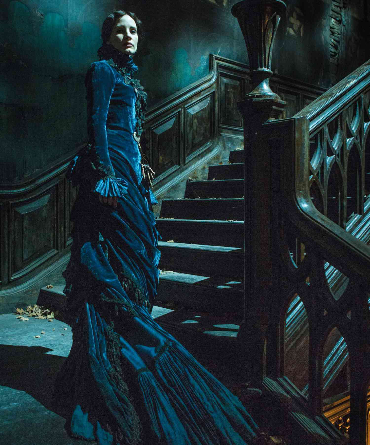
Many of these images that engage the genre and its baggage are created through the way the characters are attired; Edith is the “new woman,” later a “woman in white,” Lucile the “madwoman in the attic,” etc. The film’s costuming is unquestionably one of the most impressive aspects of its production, both in its narrative purpose and in the skillful craft utilized to make the pieces. Each garment works to establish visual motifs associated with the characters, the silhouettes accordingly loose and flowing or sharp and constricting, the fabrics chose to catch or absorb the light. Lucille, the moth; Edith, the butterfly. Every anachronism in the film is deliberate, and deviates from strict verisimilitude in order to convey meaning. The most discussed anachronisms in the film are the costumes of the Sharpe siblings which look to be of the natural form era, some twenty years before the present day, 1901. They are attired in dark and precisely fitted clothing, enveloped in velvets, always appearing out of place and out of time when they engage with society in the modern Buffalo. Despite there being no historical likelihood of one wearing clothing so long out of date while running in the circles the Sharpes do, it is incredibly accurate to the past decade. Here their visage is used to convey their occupation of the past and entrapment in their family history/home (they wear their parent’s clothing, after all). It makes it perfectly fitting that they are always in darker shades, weighed down, entirely unlike the bright silk and airy cotton voile we see the other cast wear.
The costuming of Lucille Sharpe. The color palette and form of Lucille’s gown visually ties her to the house. The center photo shows progress on passementerie used for Lucile’s costumes, the design recalling the shapes of Allerdale Hall itself.
Lucille exemplifies this in particular; she moves through the Allerdale Hall as though a part of it, which is reflected in her garments. She melds with the walls, made of the same cold and harsh visual language. Seen in Hawley’s sketches, the architectural elements of the house were replicated in the gown’s construction. At the start of the film as well, her “drop of blood” dress is a taste of the distinctly crimson ghosts to come later. As the character most inextricably bound up by her past and childhood traumas, her intensely visual link to the house amplifies the sense of haunting and entrapment. So very defined by the past, she breathes, bleeds, and decays with the house.
The choice to costume Lucille (and Thomas as well, but to a less dramatic extent) in this manner is impactful even for those not knowledgeable of dress history. It creates two visually distinctive sites, conveying the characters’ psychologies and relationships to their respective haunted pasts; one can discern which world the characters come from in but a glance. When those worlds collide, so do the visual motifs in the costuming. With the Sharpes at their most vulnerable — also their most dangerous, in Lucille’s case — the dark layers that envelop and constrict them are removed. For both this removal of layers takes place in scenes with Edith, her presence disrupting the disconcerting equilibrium they’ve created, narratively, interpersonally, and visually. Thomas is his least formally-attired in the film during a moment of intimacy, and Lucille is only once seen dressed down at the climax. There, she and Edith face off as visual equals, both bloodied in their flowing nightgowns with hair trailing behind them.
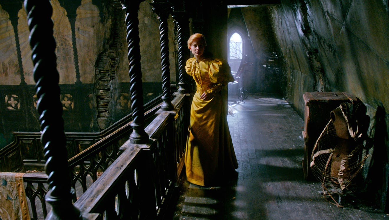
Edith furtively moves through Allerdale Hall, wearing her “Nancy Drew” dress during her investigative escapades. The otherwise dull light catches on her soft and gold silhouette, shimmering and dissonant with the set.
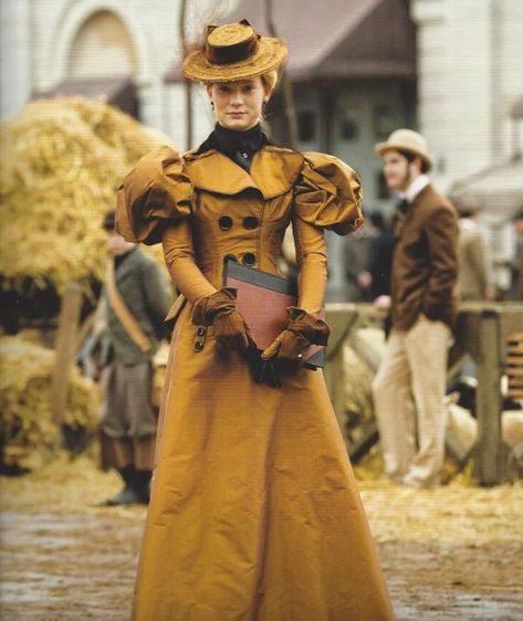
For the majority of the film though, Edith’s costuming is the antithesis to the static, past-oriented world of the Sharpes. Hawley costumes her in ways that emphasize her contrasting values and mode of living with the rotting Allerdale Hall. Edith’s world is brilliant, progressive, and certainly touched by the macabre but not consumed by it. There is almost always a tinge of something dark that accents her outfits, though it can take a keen eye to find it. For example: amidst the black at the neck of her walking suit a minute skull pin is nestled, the same one used to pin her tie in a later scene. Or take the gleaming golden-yellow of her “Nancy Drew” dress (above, left, and right), which is complimented by a stark black bow dangling from her neck. Yet when she moves into darker environments, she still remains just as out of place as the Sharpes are in Buffalo. The flowing yardage of mid-1890s skirts and the weightless quality of the puffed sleeves makes her stand out as a bright speck embodying the new and modern amidst the decaying gothic world she is transplanted to.
There is also the anachronism of our protagonist’s costuming to consider; a notable and rarely discussed aspect of Edith image is that she, too, is not attired appropriately for the year the film is set in, though the discrepancy is less severe than the Sharpes’. Her visual presence is especially powerful in the ways it engages Victorian culture, drawing upon recognizable media of the time to make a statement about her character. To many, the difference of several years is not noteworthy but the choice itself remains significant. Edith evokes a very particular image — that of the “New Woman,” with its ties to the Charles Gibson illustrations that produced the eponymous Gibson Girl type. Putting Edith in this suit and other such garments creates visual associations between her and the image of the emancipated woman, who engages eagerly with the freedoms afforded to her by shifting social dynamics.
Left, a Gibson Illustration for Scribiner’s, published 1895, via https://www.loc.gov/item/2002720198/#. Right, costume designer Kate Hawley’s sketches of Edith Cushing’s costuming.
Most of Edith’s dresses could be more accurately dated to 1895-1899 rather than 1901, when the puff on the sleeve begins to drop and the front of the bodice gains body in the pigeon-breasted silhouette. She is clearly evocative of this late 1890’s modern woman, the type you might see on cycling advertisements that remind one of the era’s feminist discourses. Hawley seems to be directly inspired by these images and the associated type of woman. Edith is seen with a bicycle in one sketch, and in the film she recalls women’s shifting place in the workforce as she types her manuscript in an office, bespectacled, looking to improve her chance of being published by modifying her perception.
Edith earlier in the film, and later in the same chair. Doubles of such set pieces were made to create this sense of smallness as her circumstances become increasingly dire.
The film also uses visuality in ways that have great effect while using tactics difficult for audiences to identify. The environment itself is subject to subtle changes as the narrative progresses that (similarly to many of the costuming details) are unnoticeable even as they feed influential visual information to you. My favorite example is how as Edith’s situation becomes more desperate and chances of escape look less likely, the furniture she sits in changes size. The weaker she grows, the larger the chair she sits in; her psychological state comes through in this changing physicality that creates an illusion of diminutiveness. These set pieces, among many other props, are featured in the At Home With Monsters exhibit. All these components of Crimson Peak‘s visual environment were crucial to the creation of depth. The film’s visual construction requires an almost literary approach, making close looking rather than close reading the preferred method of analysis. If you’ve seen the film, did you notice that the word “fear” is subtly incorporated into the background sets, even in the wallpaper?
Concept art of the wallpaper in Allerdale Hall by Guy Davis. The word “fear” is worked into the moth-like shapes, almost imperceptibly, via https://www.instagram.com/guydavis.art/.
I believe Crimson Peak can be endlessly examined in its tactful use of visuality blended seamlessly with its storytelling, but at some point this post must come to an end! I’ve seen the film countless times since its release, and continue to identify previously undiscovered uses of visual language signifying things I could not have known I was missing. I’ve often wished I had had a chance to visit these exhibitions myself, as I’m certain an in-person look at the costumes and props would reveal even more detail and care than I’ve discussed here. The meticulousness of Kate Hawley’s work on the film is commendable and always a treat to dig into, as it’s given so much life to Del Toro’s vision; I find that the more closely I look, the more fruitful my readings. The visual subtext in Crimson Peak is abundant, as is its engagement with Victorian visual culture, making it irresistible to explore just how we might look deeper yet.
Thanks for reading!
Works Cited
Crimson Peak. Directed by Guillermo del Toro, Universal Pictures, 2015.
All other images are from the listed exhibits, the film itself, or Kate Hawley’s personal images and artwork provided for said exhibits. Conceptual artwork is all sourced from Guy Davis, via https://www.instagram.com/guydavis.art/.
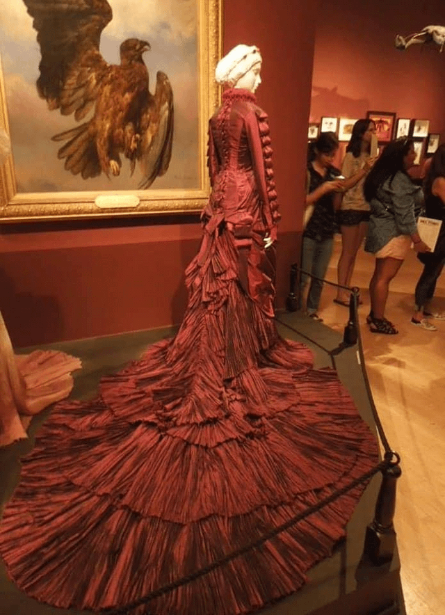
“Victorian Masterpieces from the Museo de Arte de Ponce, Puerto Rico” is currently an exhibit at The Metropolitan Museum of Art in New York City, New York. When searching for current exhibits, the pieces within this collection caught my eye as they hold more in common than the provided description of Victorian paintings from the Museo de Arte de Ponce. The exhibit pieces are The Prince Enters the Wood by Sir Edward Burne-Jones, The King and His Court by Sir Edward Burne-Jones, The Sleeping Beauty by Sir Edward Burne-Jones, Flaming June by Frederic, Lord Leighton, and The Escape of a Heretic, 1559 by Sir John Everett Millais.
The purpose of the exhibit is to display prominent Victorian paintings that have not been able to be on display due the Museo de Arte de Ponce being closed from earthquakes. This gives the audience the ability to not only see pieces that have been hidden from public view since 2020 but also for a different regional audience to gain access to the paintings. The ability to create an exhibit that only adds to the current Victorian paintings at The Met allows a further understanding of Victorian visual culture as more themes can be viewed next to each other.
By looking at just the work within the exhibit, however, the audience can see a persisting presence of vulnerable positions in all of the paintings. All of the Edward Burne-Jones paintings belong to a series The Legend of Briar Rose that includes one more painting that is not included in the collection. The three Burne-Jones painting showcase a variety of groups in unnatural positions of what could be deemed sleep or death. Additionally, there is one person in each that is elevated above the rest, whether this is someone stumbling across the scene and thus the only person awake, as in The Prince Enters the Wood or as someone who is in the same sleep as the rest but their body is physically elevated above everyone else as in The King and His Court and The Sleeping Beauty.
This theme is not absent from the other two artists’ paintings, however. The most similar is that of Lord Leighton’s Flaming June, which depicts a young women sleeping under the sun. This piece does not have the same deathly stillness that is seen in the Briar Rose collection. Instead, the subject is flushed from the sun, wearing a bright orange gown that matches the vibrancy from her skin and hair, resting from a matter of exertion from the day.
The final painting, The Escape of a Heretic, 1559, at first appears drastically different than the prior pieces. The main subjects, a young woman with a yellow fabric hanging in front of her otherwise dark dress and a young man with a knife above and behind her head. Just out of focus and behind the two is an older man, obscured by a white fabric across his lower face and neck. However, upon closer inspection, the audience can see a rosary wrapped around his mouth and above the fabric with his eyes wide and hands behind his back. By reading the description, the audience learns that the young woman is fleeing during the Spanish Inquisition. The older, gagged man, a friar, looks on as the young man, disguised as a friar, helps to disguise the young woman in religious robes. A scene that at first appears to be threatening revealed to be an act of escape from the church they dress themselves as. There are not, however, any subjects that could be likened to sleep. If this collection is viewed instead as a recognition of vulnerability, however, there is a better connection between the pieces in the exhibit.
From the existence of groups that cannot be understood as asleep or dead to a sleeping women within a frame, existing to be viewed in the exposed state, to both the man tied and the woman escaping him, all scenes displayed in the collection force an understanding onto the audience of the risk for vulnerability. The vulnerable, each joining other paintings by their same artist, such as Leighton’s Flaming June with Lachrymae, the Briar Rose series with The Love Song, and The Flight of a Heretic, 1559 with Ariel, while also leaving the collection of Victorian art that Museo de Arte de Ponce has curated.
Open until February 2024, I hope to visit to experience a greater collection of Victorian paintings before they return home to Puerto Rico. It would a unique experience to be able to view such paintings near their natural counterparts, unveiling a multitude of stories that represent the basis of human experience in it’s most vulnerable state.
Works Cited
“El Metropolitan Museum of Art de Nueva York Presentará Cinco Obras Maestras Del Arte Victoriano Prestadas Por El Museo de Arte de Ponce.” Museo de Arte de Ponce, 1 Sept. 2022, museoarteponce.org/el-metropolitan-museum-of-art-de-nueva-york-presentara-cinco-obras-maestras-del-arte-victoriano-prestadas-por-el-museo-de-arte-de-ponce/. Accessed 15 Dec. 2023.
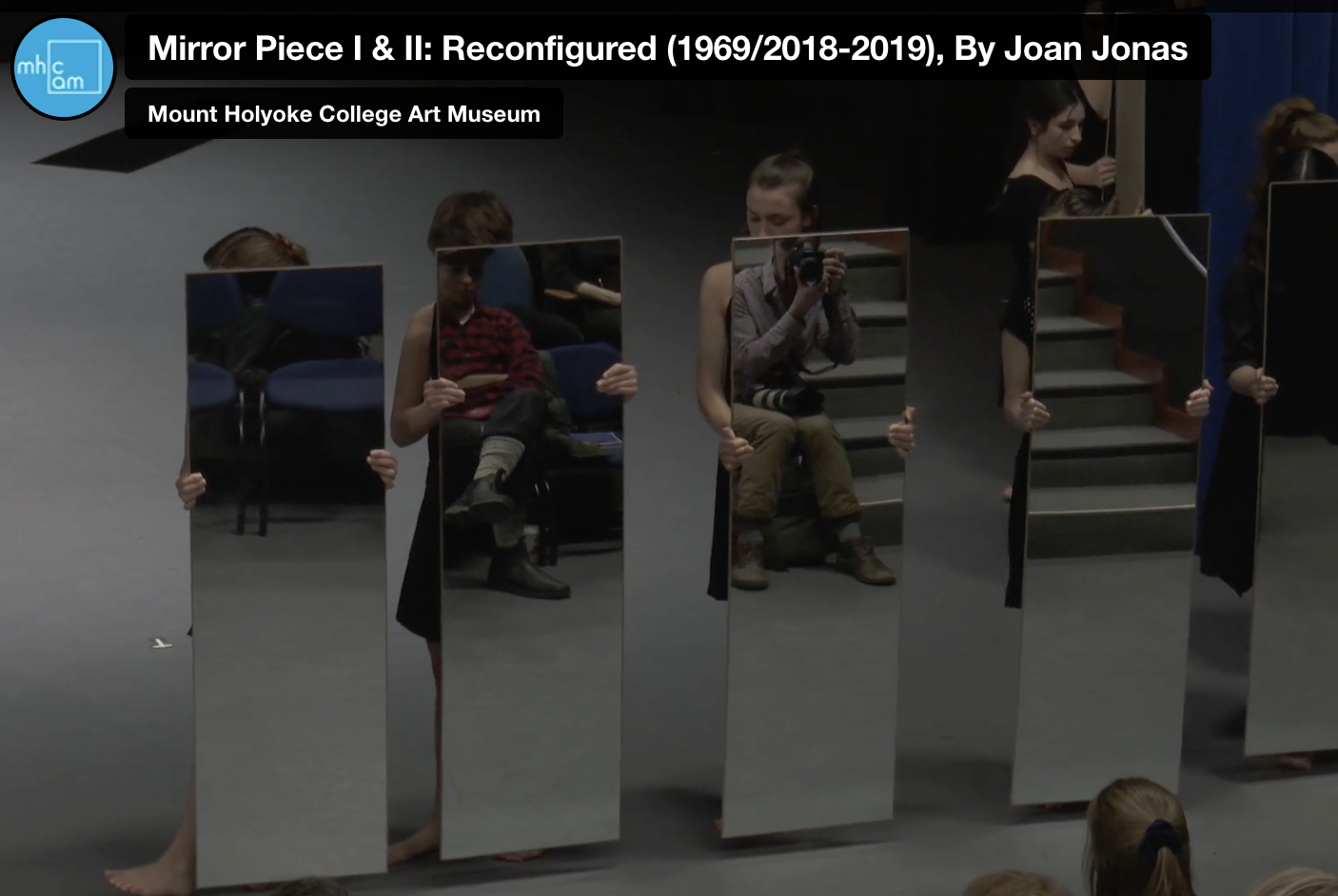
I chose to review the Mirror Piece I & II: Reconfigured (1969/2018-2019), which can be found on the Virtual Tours through the MHC Art Museum website. It was performed on January 31st, 2019.
When browsing through the exhibits on the MHCAM website, this particular dance piece stole my attention. I’m incredibly impacted by visual art produced through dance. As someone who grew up with dance, I was always so aware of the power that physical movement can create. Movement through dance can tell stories that words sometimes can’t reach. Much like photography, dance can invoke emotions and feelings in the people viewing. Dance is traditionally a spectacle, with the audience projecting its gaze onto the people performing. As a performer myself, the relationship of gaze between the performer and the audience is very one sided. The gaze is normally never projected back onto the audience. However, one of my favorite parts of this exhibit is when the dancers walk out with full length mirrors obscuring their bodies. They walk slowly in a single file line with the mirrors directly facing the audience. When they stop, it forces the audience to look at themselves in the mirrors. Above I caught a screencap of a photographer being captured by the mirror while simultaneously capturing photographs. After seeing this, I knew I wanted to watch the rest of it and write my review on it.
The choreography and staging was created by Mount Holyoke Alum Joan Jonas (‘58), who originally put on these performances in 1969 and 1970. Mirror Piece I was originally held at New York University’s Loeb Student Center and Mirror Piece II at New York’s Emanuel-El YMHA. The pieces were performed by a group of women holding large mirrors, and occasionally two men appeared to carry and place the women in different positions throughout. Mirror Piece I and II were inspired by Jonas’ interests in “gender hierarchies, the power of the gaze, and notions of perception and representation,” ultimately opening up her career in performance art. In 2019, the Mount Holyoke Dance Department and Joan Jonas reconfigured the staging performance.
I can only describe watching this performance for the first time as mesmerizing. The slow movements of the dancers direct your attention to each step they take, giving you ample time to watch and understand the movements. The use of the large mirrors obscuring the performers is captivating to watch. Sometimes all you could see were the performers’ heads, or their feet. Sometimes they would lay on the ground and only show their limbs. Each choice and each step was carefully chosen and carefully thought about. It made me think about what it really means to perform, and what it really means to perform for a larger audience.
There is something quite meta about watching an audience watch their own reflections through a performance they are watching. I looked into one of the mirrors through my computer laptop and instead of seeing myself I saw the reflection of a woman, a man, maybe somebody’s grandmother, maybe somebody’s lover. It was cool to think about how this experience differs virtually and seeing it live.
Another aspect that stood out to me was the physical tilting of the mirrors. Many times throughout, the performers would tilt the mirrors upwards and the overhead lighting in the auditorium would refract off of the mirrors. This simple movement would create lights that flashed directly towards the gaze of the audience. It reminded me distinctly of turning on a flashlight. As for the sound, the majority of the piece is done entirely in silence. This choice not only enhances the haunting nature of this piece but it makes you focus on the movement itself.
Finally, it is worth noting that there was one performer chosen to hold a large pane of glass instead of a mirror. Unlike a mirror, the glass is clear and completely see through so it is unable to reflect on the audience. Instead the sheerness allows the audience to see through and observe the performer’s movements. Opposite to the gaze of the mirror, the audience could project onto the glass to decipher the movements that they are denied. This artistic choice is incredibly interesting to me, because it creates a crack in the wall that the performance creates. It made me question what is being obscured and where I should be looking, at myself or the performer?
Overall, this virtual performance was completely worth looking into. It creates an aura that is calming yet thought provoking. Visually it stands out as a living work of art. It tells a story that the eyes of the gaze are a part of. The audience performs as well, making this video one I will definitely rewatch in the future. It left me with a lot of questions, but questions that are worth ruminating and finding answers for.
After spending most of my life in a big city, I have found that people-watching those who pass me on the street has become second nature. Even if it’s just admiring their fashion choices, simply stepping onto a busy street means that you are viewed by others. In the present day, we can glimpse what it must have been like to view those in the Victorian era through Victorian street photography. Pictures like those of the covenant garden flower women (pictured) allow us to better understand the economic struggles of the time, while also presenting the photographs’ subjects for our judgment.
This first-impression based way of thought is true even today, albeit with different expectations associated with appearance. Much of today’s person-focused street photography, which can be seen on social media platforms like Instagram, presents people at their most fashionable. This sets a difficult-to-achieve precedent for others, who may not be able to afford such fashion; they become something for others to aspire towards, and someone to admire. Similarly, however, both in the Victorian era and now, photography is rarely candid, but for different reasons. The time to take a photograph was longer due to exposure times in the Victorian era, which required thoughtful posing of the subjects. Meanwhile, in the present day, presenting your best self on social media requires a similar time commitment to getting your appearance and pose just right. The act of people-watching may never change, but the way in which we utilize photography as an art when taking pictures of pedestrians may continue to evolve with the times.
Even before rereading “Alice’s Adventures in Wonderland” for this class, I was familiar with the existence of an “Alice’s Adventures”-inspired musical, but this unit gave me an excuse to see what the musical was actually about, and whether it visually embodies the version of “Wonderland” seen in the original story.
“Wonderland,” formerly titled “Wonderland: Alice’s New Musical Adventure,” was on Broadway starting in March of 2011, and was forced to close in May of 2011 after negative reviews and a low box office made them lose millions of dollars.
I believe that what “Wonderland” gets wrong (and the critics agreed) was that revisionist fairy tales must be done with care to preserve the source material they are revising. In the case of “Wonderland,” this is done clumsily by making the character of Alice a single mother and children’s book author who has just moved to Queens, NY, and who falls down her apartment’s elevator shaft into Wonderland. What follows is a musical which combines almost every genre of music imaginable, in a manner that seems less fantastical and more messy.
Frank Wildhorn, the creator of the show’s music, told Playbill:
“If you’re going to go to a place called Wonderland, it’s a phantasmagorical place, so you really can set your own rules, and in fact, if you establish that the rules are going to be a rule of eclecticism, and you’re consistent with that, you can go anywhere from […] classical to boy-band.”
Reviewers interpreted Wildhorn’s vision differently, though, and said that it wasn’t coherent, and that it “sheds no bright or at least interesting 21st-century insights on the Victorian material.” Personally, the problem with the show’s songs is less with the music, and more with the lyrics relying on referencing other musicals, like “Evita” and “Wicked;” it seems over-the-top and unnecessary to be a musical based on a classic children’s book, while simultaneously drawing attention to more modern pieces of work.
The plot’s connection to the original Alice begins and ends with the characters– almost all of the characters from the original work appear in the musical, although they have been changed in an attempt to be more interesting for the modern audience. As previously mentioned, Alice is now a single mother living in Queens, but the most drastic change is to the character of the Mad Hatter, who is now a “6-foot-tall dominatrix in thigh-high boots,” according to Entertainment Weekly. The musical’s big plot twist is that the Mad Hatter is meant to represent Alice’s dark side, both metaphorically and literally (she is meant to be Alice’s alter-ego, created when Alice never went to Wonderland as a child). To the character’s credit, she does have a rather good villain song (“The Mad Hatter”).
The inclusion of a character meant to be Lewis Carroll seems to be there simply to serve as an anchor, connecting the source material to this poorly-written musical. However, by making Carroll appear to be a sort of guardian-angel figure to Alice doesn’t make any sense, and gives the real Lewis Carroll far too much credit.
This musical journey through Wonderland is convoluted and is obviously trying to be as fairytale-esque as possible, while simultaneously mistaking randomness with the nonsensical fantasy seen in the original Wonderland.