Posted by: lorajushchenko | December 12, 2023

The “Victorian Virtual Reality” Exhibit at the Watts Gallery

While searching for virtual exhibits to explore, I stumbled upon “Victorian Virtual Reality,” which is currently on display at Watts Gallery. I’m sure that, like many, one of the first things to catch my attention was not the exhibition itself, but the archive from which it was partially built– none other than the personal collection of Sir Brian May. Yes, the Sir Brian May of Queen fame. 

The exhibit explores “Stereoscopy,” which is the adding of depth to an image by having the viewer look at two images that are slightly off from each other. The exhibit contains historically Victorian stereoscope photographs (also referred to as “stereo images”) which give visitors a peek into the lives of those who lived in the Victorian era. It also gives visitors a chance to see Sir Brian May’s first stereocard (pictured below) which he obtained in 1959 in a cereal packet when he was twelve years old. This stereocard, and the 3D viewer he ordered to use with it, are what fueled his lifelong interest in, and passion for, stereoscopy. 

The exhibition also contains loaned pieces from Rob Dickins. Besides being a trustee at the gallery, Rob Dickins also had a long career as a British music executive, signing artists such as Prince and Joni Mitchell. Rob Dickins is also known for his collections of Victorian-era photographs, totaling over four thousand photographs, all of which he donated to the Watts Gallery in 2007. 

Using the museum’s audios for the exhibit, I was able to both view the exhibition, while listening to descriptions of some of the highlights of the exhibit. I learned about the 1832 invention of the first stereoscope, which used mirrors, by Sir Thomas Wheatstone. Later, in the 1840’s, the addition of lenses became the most popular stereoscopic technique. 

The photographs needed to be taken sequentially, in dark light, in order to make the images sharper. This was made even more difficult due to the long exposure times needed for all photography during this era. There also needed to be a dark room nearby, which is why portable dark rooms were commonly used so that stereoscopic photographs could be created anywhere. 

One of the most interesting stereoscopes the exhibit mentions is what they refer to as the “Oxford” photos, which are two stereoscopic photographs, both of which have a group of men standing in the foreground. However, the first image has the addition of “the Oxford photobomber,” a man who came to see what the photographer and his subjects were doing, and in doing so, ended up appearing in the background of the first image, while not appearing in the second one. I feel like stereoscopes like these show how truly difficult it was for photographers to control their environment in the Victorian era, and how shorter exposure times truly changed photography. This makes early stereoscopes of nature, like of the hippos in Sir Brian May’s first stereocard might have been, even more impressive. The later invention of the twin-lens camera allowed for both images to be taken simultaneously, saving both time, and the patience of the photographer and subject!

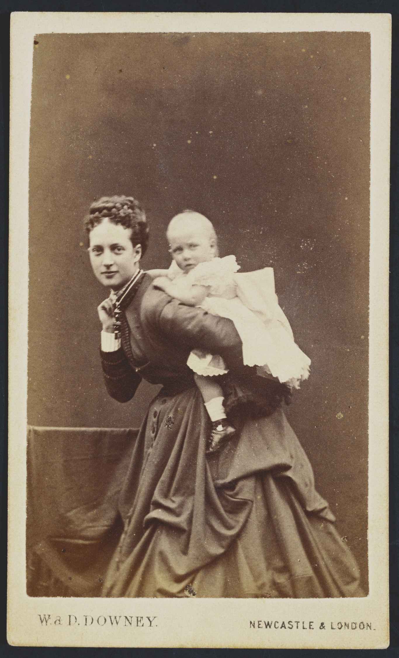
Child photography was also different using this method. Rather than utilizing ghost mothers, as seen throughout our course with Victorian photography and portraiture, stereoscopes sometimes used methods like waiting until the child was asleep to photograph them in order to keep them still. However, the Victorian interest in ghosts and the general supernatural wasn’t completely eliminated from stereoscopy. Instead, it just became a more fantastical type of photography, with the twin-lens camera being used to create ghost-like figures in dark rooms indoors, which allowed the light and movement to be better controlled. 

The exhibit is scheduled to be open now, until February 25th. I know that I, personally, plan on visiting in person when I go abroad in the Spring. The “Fantasy” section of the exhibit is what interested me most in the virtual tour, and I’d love to learn more about the specific techniques used to make Victorian stereoscopy appear more ghost-like. I might even check out their gift shop, and buy my very own stereoscopic viewer so that I can bring the Victorian era home with me!

https://www.wattsgallery.org.uk/exhibitions/victorian-virtual-reality

The collection of Mary Ellen Mark’s photographs on girlhood is a wonderful series honoring feminine adolescence throughout time and space. This in person and online exhibition was organized by the National Museum of Women in the Arts, and it was made up of photographs gifted to the Museum over a span of fifty years by the Photography Buyers Club. I wasn’t sure of who Mary Ellen Mark was before I fatefully clicked on the link to this exhibit, but I think that I’ll be doing some more research on her after looking at the collection. 

These photographs spanned from 1965 to 2014, and they featured girls from India to Turkey to Twinsburg, Ohio. I was attracted to the title of the exhibit, first and foremost, because I’m often interested in photographs capturing girlhood and femininity, and it delivered. Most of the photographs were black and white, capturing candid moments in the girl’s lives. Some were young girls, five or six, playing, and others were teenagers in love. 

One of my favorite photographs was Child Acrobat with Two Children in Peacock Costumes, Great Royal Circus, Himmatnagar, India, 1989. The first things that caught my eye were the beautiful costumes, mainly the contrast between the white leotard that the acrobat is wearing and the amazing peacock costumes. The detail captured is beautiful, and it’s full of whimsy; it made me curious as to what they would have to say. Between the children, I’m struck by the power of three. The caption has a quote from Mark, “I wanted to document the lives of the people when they weren’t performing…. If I had photographed from the audience’s point of view, I would have just been a spectator.” 

This connection between the photographer and photographed seemed more intimate than usually presented— the trust between Mark and the girls reminded me of the relationship between Julia Margaret Cameron and her subjects. Mark often captured girls in vulnerable situations; pregnant teenagers, unhoused girls, the mentally ill. Through the demeanor and the composition of the photographs, it’s easy to tell that Mark familiarized herself with her subjects. The tones of her photographs are often based off of the girls she’d feature; she’d give them free range to pose and express themselves. Because of our discussions of unethical photography in class, this context provided by the Museum was very helpful, and I found it let me enjoy the photographs more than if I was left to wonder about the context of the images. Her determination to photograph and document girlhood across class, cultural, racial, national, and time borders is honorable, especially as she kept relationships with some of these girls into womanhood. 

On a lighter note, Mark also spent a period of time photographing twins in Twinsburg, Ohio, and some of those photographs were included in this exhibit. I absolutely loved these photographs! This might be because I am a twin that’s been similarly photographed before (long story), and because of the fact that even though the photographed twins are styled identically, their personalities manage to shine through! My favorite twin photograph is composed of two girls wearing cowboy costumes and holding stick horses: Tashara and Tanesha Reese, Twins Day Festival, Twinsburg, Ohio 1998. Though it’s youthful and a little silly, Mark treated her subjects with dignity and respect. Both girls are making eye contact with the camera, or the viewer, and they wear slightly different expressions. Even though I am somebody viewing this photograph over twenty years after it was taken, and I may not know which twin is which, their different personalities are captured. 

Mark also worked to document the authentic joy of girlhood. A few photographs in this collection, such as Singing on the Beach, Wilwood, New Jersey, 1991 and Batman and Barbies at the Toys “R” Us Holiday Parade, New York, 2002, show the jovial joy that comes with youth. These two photographs show it in two different phases of adolescence; preteen girls singing on the beach, and younger girls dressed up as Barbies for a parade. 

The spanning of cultures, age, time, and emotion that was captured by this collection is vast and impressive. It’s a series of photographs that understands the true range of growing up as a girl, and because so many girls became subjects, the viewer can conceptualize the similarities and differences that make up girlhood. Mark captured the timelessness of girlhood, the universality; pain, love, grief, beauty, joy, play. 

I believe that attending this exhibit in person would be quite moving, but I’m not sure it’s quite in the deck of cards. However, it’s a beautiful and delightful experience, and I’m very glad to have both seen these gorgeous photographs and to have learned about a new photographer. I recommend this exhibit to folks who like Ansel Adams or, as I previously mentioned, Julia Margaret Cameron.

Here’s a link to the exhibit! https://nmwa.org/whats-on/exhibitions/online/mary-ellen-mark-girlhood/

Posted by: jennykirk02 | December 11, 2023

Collage as a View into Women’s Spaces 

Collage is a fantastic way to get a magnifying glass into Victorian culture, and to understand the potential individual interests of the average Victorian person through their creations. Because collage was such an accessible art form, and was directly connected to tangible reality through the usage of real photos, drawings, and text, we’re able to get a full view of what Victorian collage artists were reading, looking at, and imagining. What media was used within their collages revealed the media that was so available for use that they were even disposable–that is to say, what their equivalent for magazines and newspapers were. The scenes that were chosen to be depicted were scenes so intentionally created that they must reflect the internal thoughts of their creators. As a result, we as viewers of these collages get a view into these home-artists brains and their domestic lives. 

A wonderful example of this phenomenon lies within the works of Victorian women, who were the ones most commonly creating these collages as they were the one most often in the home. I find these pieces in particular to be the most interesting, as I find that within them, women seem to create their own space in a world where they have little chance to do so in reality. This becomes notable in different ways–there are common depictions of a living room with a warm fire, comfortable chairs, and plenty of people, which implies said woman’s ideal homespace which is populated, warm, and restful. This can become clear in other ways too, though, for example the multiple collages of babies within flowers. Although this points to simple maternity, and was potentially created simply because mothers found it to be cure, it also points to the desire for safe and peaceful children, particularly by mothers, and especially during a time where infant mortality rates were so high. These pieces of art create scenes of ideal conditions for the women who made them, a construction of a safe space by those who perhaps could not find them, or who felt unstable within them. Here, women were able to become the creators, the owners of the home they pasted together, rather than simple objects owned by their husbands, sons, and property.

This could be construed as sad–women were forced to paint their own scenes as a result of their lack of peace and security in their reality. However, I can also find it to be quite joyful and optimistic. It was possible that these collage-artists were fairly happy in their situations, likely because most of them were upper to middle class, and that they simply enjoyed daydreaming and working in a creative manner. Even in modern day, I enjoy doodling my ideal bedroom, and spend hours on pinterest scrolling to find the perfect colour palette for my imaginary apartment in London. It is likely that collages were the same for Victorian women my age–daydreaming and creativity, rather than pessimistic escapism and yearning. Regardless, these collages are endlessly fascinating to me, and I enjoy the way they humanize history in a way I can relate to so many years away.

Posted by: Haley McDowell | December 11, 2023

The British Royal Family in Media

The development of the celebrity by the means of photography is fascinating, especially in comparison to the modern day representation of celebrities. Paparazzi as a career based upon the exploitation of another’s image for the sole sake of distributing the personal lives of celebrities could be an entirely different post, but I wanted to explore the British royal family’s representation in media. From our class at the beginning of the semester showing a carte de visite of the Princess of Wales, I have thought about the purposeful and sometimes accidental examples of photography of the British royal family.

Alexandra, Princess of Wales carrying Princess Louise 1868.
Photographed by W & D Downey.

The image above of the Princess of Wales allows the public an exclusive insight into the royal family, allowing them to create an image to portray to the public. Instead of being seen as a royal with privilege the public would never be able to obtain, the princess is dressed more modestly, without the opulence that they possess such as jewels and more extravagant clothing. With her child on her back, she can be seen as a mother, something that will be relatable the very people who will buy the image and support the monarchy as legitimate.

The Crown poster 2023. From The Today Show.

The modern day representation of the British royal family is seen most notably in the Netflix show The Crown. Even as it has faced backlash for taking liberties and not reminding the audience that the show is a fictional tv show. Even so, for a majority of viewers, the show has led to a broader audience to understand the recent history of the British royal family, offering a sympathetic presentation of the family while still allowing room for critique.

The ability to control how one is represented has only decreased over time, as represented by the two examples of visual media of the British royal family. While the family has an agreement with the British press, their ability to guide the media to see only what they wish the public to view is not an ability they have control over. This cannot be discussed without bringing up the consequences of such a lack of control. The death of Princess Diana as the cause of paparazzi trying to get a photo of her with her boyfriend resulted in what most would cite as the modern day decline of the public’s opinion of the royal family.

The decline of the ability to control one’s image is the ultimate difference between the beginning of the royal family’s visual representation and what can be seen today. They can no longer hide their opulence and make the public sympathize with the shared understanding of motherhood as more information is made accessible and the stark differences between the two classes become more apparent than one is able to ignore.

Works Cited

“New Character Posters for Season 5 of “the Crown” Show “a House Divided.”” TODAY.com, 18 Oct. 2022, http://www.today.com/popculture/tv/new-character-posters-netflix-season-5-crown-show-house-divided-rcna52695. Accessed 11 Dec. 2023.

“W & D Downey (Active 1855-1941) – Queen Alexandra When Princess of Wales (1844-1925) with Her Daughter Princess Louise (1867-1931).” Www.rct.uk, http://www.rct.uk/collection/2927796/queen-alexandra-when-princess-of-wales-1844-1925-with-her-daughter-princess. Accessed 6 Dec. 2023.

Posted by: Grace McMurray | December 11, 2023

Harwarden Photograph: The Camera in the Mirror

During class, I was particularly interested in the Hawarden photographs. In many of the photographs we looked at in class, Hawarden’s daughters are prominently featured alongside windows and mirrors. One photo stuck out to me:

Until now, I had never really seen a Victorian photograph with the camera included in the photo, especially through the gaze of the mirror. Mirror images usually reflect some kind of image back of the subject looking through the mirror itself. I think the gazes in this photograph are worth looking into. You would think that Hawarden’s daughter would be reflected in the mirror, yet she is not. The gaze of the camera looks directly at the mirror, so the camera is reflected back. Hawarden’s daughter’s gaze is looking at the camera, not at the mirror. 

From this perspective, it almost reads as the camera is taking a picture of not just the daughter but the mirror as well. The reflection of the camera in the mirror is not just an accessory; rather, the camera becomes a subject that stands beside Hawarden’s daughter. It raises the question: what does it mean when the camera becomes a subject in a photo?

When a camera becomes a subject in a photograph it creates, it feels like seeing a doppelganger, especially within the Victorian lens. It feels uncanny, but in modern everyday photography I see cameras in mirrors all the time: especially when people take pictures of themselves in a mirror through their phones. It is a modern example of the camera becoming a subject within a photo that has been completely normalized, yet the Howarden photo leaves me with a strange feeling of seeing the large old fashioned camera in frame. It feels haunting, like a ghost. 

The difference between the haunting of this photograph compared to modern mirror photography may be due to the absence of the photographer. The photo makes it look like the camera came to life and snuck up behind Hawarden’s daughter and took a photo of her all by itself. When the camera becomes a subject, it becomes humanized. The mechanical becomes sentient, a fantastical image based in reality. It is truly an incredible photograph, one that alters the traditional gaze, perspective, and subject of a Victorian photograph. 

Posted by: sagespree | December 11, 2023

Reflections on Disposable Film

I, like many others this past year, have hopped onto the trend of disposable film cameras. Armed with my Fujifilm Quicksnap in hand, I marched around the streets of my hometown and clicked away at anything I could find. Photo albums quickly filled up, mimicking the books of printed out digitals my parents made of my childhood. Most of the time it is nothing but mindless fun. But taking this class has made me wonder why, in fact, I and so many people are now drawn to these cameras.

There is the obvious: it is a physical, tangible medium. Each click feels like a memory taken down and noted, whereas on my phone it feels fake. The colors on my screen could be as fickle and vague as the images I hold in my mind. When I unwrap the package of developed photos, it is a sort of transformation: the immaterial has been made real. A magical, physical testament to my experiences and life. There’s a stability to that kind of thinking.

Yet this sentiment doesn’t feel totally honest. I could print out the pictures on my phone if I wanted to. But the blurry, off-color quality of the disposable camera is its greatest appeal. It harkens back to a time before I was even born, when film cameras dominated the field. I take pictures to copy a feeling that I myself have only ever experienced in other photographs. It raises the question: why do the style of old photographs feel more authentic than modern ones?

I come back, then, to the discussions of photography’s truth claims. It is easy to see that the thousands of images in my phone gallery are not representative of my life — I know the story behind them. But when we are taken out of that context, suddenly it is not so hard to believe in the narrative of the photo. To buy into the fact that maybe there did exist a simpler, happier time, and that that nostalgia can be recreated.

I will still keep using my silly little cameras. They bring a new joy to an activity that has become routine. But if even the very first Victorian photographs were not as truthful as we pretend, then maybe it is time to investigate our need to reclaim older media and technology as merely another performance.

One of the art exhibits that have stuck with me the most has been The Clark’s show title Edvard Munch: Trembling Earth. The exhibit ran from June 10 to October 15, 2023. I had visited The Clark over the summer and was amazed by this section that I had originally not intended to look over very closely.

Edvard Munch: Trembling Earth takes a departure from the well-known portraits of Munch’s and instead focuses on his landscape work, mostly on the forests that surrounded him. Munch (1863-1944) lived in Norway and Germany alternately throughout his life, and preferred the peace of the countryside. His abundance of landscapes came from an attempt to wrestle with the vitality of nature against his own mental state during the time of industrialization (“About the Exhibition”). This was the only appearance of the exhibition in the U.S., before it travelled to Potsdam and Oslo. The Clark groups the works in sections by their formal qualities, such as “Snow and Storm,” “Cycles of Nature,” and “On the Shore.” While the paintings may seem to be only linked by their setting, there are also symbolic linkages that can be found throughout each collection. Particularly in “On the Shore,” representations of a romantic relationship are present in a way that is not found in the other landscapes. The Clark attributes this to Munch’s aim of attaching the shoreline to evocations of “melancholy” and “human isolation” (“On the Shore”). Human connection and the lack of it seemed to be a large consideration of Munch’s work, such as the innocent friendship of the group in The Girls on the Bridge, 1902. The exhibition shows that these pieces were not just recreations of his environment, but of his emotional state and social considerations as well — calling into question the very idea that the human can be separated from the natural.

However, it is important to not ignore the landscapes themselves. Munch’s style is far from strictly realistic in this collection. Seen in pieces like The Fairytale Forest, 1927-29, color and size were manipulated greatly to portray a sense of wonder, fear, or disorientation within the audience. Small figures stand against a forest brushed across with a myriad of greens, reds, and yellows in a frenetic fashion, looked over ominously by a blue and purple sky. While I read most of these paintings as a daunting or magical representation of the natural world, it must be noted that others were very much celebratory of nature’s offerings, and that Munch himself took his greatest solace in these spaces.

Munch’s landscapes remind me very closely of class discussions on the private and public spheres, particularly when it came to physical land. While Victorian era paintings may have made efforts to portray land as central to a class conflict — in which open land lies dangerously outside the controlled, private sphere of upper class homes — Munch seeks to relish in the unknown space, appreciating it for its undefined nature. Considering them together, it prompts me to ask what potential for human connection or self-realization is left out to the wilderness, untouched by efforts to remain in the private sphere.

Ultimately, I found this exhibition to be an exciting and enlightening one. The Clark made efforts to show a well-known artist through a lens that most never find out about; as someone largely unfamiliar with his work, it presented as a deeply personal look into a larger than life figure. Each section stood simply in its categories, yet subtly built a narrative of loneliness, imagination, and content across each painting. It is an exhibition that I will be thinking about for a long time.

Works Cited :

“About the Exhibition.” Edvard Munch: Trembling Earth. The Clark. https://www.clarkart.edu/microsites/munch/exhibition-overview/about-the-exhibition. Accessed 11 Dec. 2023.

Posted by: sagespree | December 11, 2023

Book Cover Illustration and The Picture of Dorian Gray

Designing book covers is an art form unto itself, and one that can have major consequences for the perception and sales for a book. For classics that have been republished dozens of times, this impact can be even more exaggerated as each new version seeks to capture a new audience. The Picture of Dorian Gray by Oscar Wilde has received such treatment. While each cover contains exciting new renovations to an old property, there are also some enduring and revealing similarities across time and continent.

Some of the most popular covers come from the tradition of more abstract designs, featuring simple patterns behind the central title of the novel. The Penguin Clothbound Classics are a beloved example: the black and white feathers on Wilde’s text adhere to the design pattern of the entire clothbound collection, yet also feels particular to the work in question. The feathers speak to the material luxury that Dorian Gray indulges in, and exudes that same decadence to the audience. At the same time, it maintains a distance from a particular art style or recognizable time period in its simplicity. The book could arguably come from any time, and thus may be more approachable to new readers.

However, many publishers take a different approach. The Penguin Classics and Barnes and Noble editions go the complete opposite direction and cement themselves in the category of classic literature. The covers are understated, with only titles on plain backgrounds accompanied with portraits of young men. The paintings clue the reader in to its older publication date and appeal to a Victorian period tale. It also is possibly more faithful to the source material — the image on the front stands in as the titular picture.

There is a middle ground between these vintage and modern marketing styles that speaks to me most. Found in a few different covers, but most prominently in the Collins Classics edition, is a blending of style, simplicity and narrative relevance. The cover is almost exclusively white with thin black text, a very unassuming choice for a long-revered classic. But this lends the central image a shocking visual impact: a cropped section of a portrait, focused on the eye. The colors jump off the page, with the natural tones exaggerated into swathes of bright pink and dark red. The blue eye grabs the viewer’s attention immediately. Blue irises contrast with the surrounding colors while the gaze carries an unreadable expression. It follows the same logic of other editions that show their choice of portrait. But Collins avoids simple representation of plot for a much more interesting depiction of the narrative function of the portrait. For Dorian Gray, his lookalike gazes back at him with all of the evil, mockery, and contempt of the world. It haunts him day and night. Similarly, this cover looks back at the audience in a way that is indeterminately accusing and observing. It demands an answer to one’s own sins from the reader as well as Dorian.

There are many methods to illustration, and each new style can be effective in different ways. Personally, I have yet to see a cover design for The Picture of Dorian Gray that I have not liked. But the Collins edition proves that visuals can be more than just a marketing pitch — it can be a transformative part of the novel, and redetermine how one engages with the work itself.

Posted by: jennykirk02 | December 10, 2023

Review: Art On Campus opening

Last Thursday, I attended the opening of the Senior Studio final exhibition for the fall semester, titled Art On Campus. It contained a diverse collection of student installations, one being my own, which were similar in only their definitions as installations–nothing else. Although I was included within this exhibition, I did find that I was still able to be surprised when I attended the opening, and had the wonderful opportunity to explore and interact with my classmates’ works of arts in vastly different and deeply beautiful ways. As the regulations to be included within the exhibition were simply to make an installation, students had the ability to create works on a multitude of diverse experiences, purposes, and themes. I found this expansive world of thought and creativity, collected within a white room, to be startlingly moving and intensely fascinating. My work, and I beside it, had become one part of the miniature world within Blanchard Gallery, and that felt wonderful. The exhibition was organized in a way that felt purposefully randomized, placing students’ work in the spaces they best fit, regardless of the themes and tones of the works around them. Rather than this appearing as confusing or un-thought-out, this created the atmosphere of emotional and creative diversity, and allowed for the audience, including myself, to explore within the room like a child, rather than the more organized, arguably stuffier ways, of a normal gallery. 

My piece, a giant, golden, hanging object, was in the center of the room which filled up the space well. In the first corner to the right of the door, an artist was creating rosaries from scratch, which would then be hung on the wall next to them from a nail. This was an immersive and wonderful experience, as the viewer was able to truly see the love and care placed into a spiritual object, and was given the gift of watching the birth and growth of a religious artifact. This was one of my favorite pieces of the exhibition, having been raised with a background of Christianity, as it allowed me to interact with my roots in a peaceful way, and respect the beauty of the practice. 

The next piece was a set of repeated prints which featured two hands holding an oyster, bordered by two self-portraits of the artist, and studded with paper stars. This piece, as I understood it to be about traumas of the body, felt profoundly personal and emotional, and it appeared to resonate with many besides myself. I found it to be a visceral and thoughtful work, and stayed with it for a long time–to me, the oyster represents femininity and the body, and the hands holding it seem to be protecting it. The self portraits seemed to watch me watching the hands, and I left feeling somewhat stripped down and observed. This piece was already very spiritual to me, but especially being on the wall directly next to the rosaries, this became intensified. To me, personally, the two installations felt like religion through community, and religion through self, and I thought that unintentional pairing was very beautiful in a genuine way.

Across from this wall was an even more interactive installation, which happens to be my favorite kind of installation–I like touching the art! It was a white pedestal which held multiple mugs, carnations, small squares of paper, markers, and instructions to write about something which made you happy and to take a flower in return. I would revisit this installation often within the next few days, coming away each time with a new color of carnation in my hand. As the pile of papers grew taller inside the mugs in which they were meant to be deposited, the artists began to paste them onto the wall behind the pedestal, and it became a climbing wallpaper of the most joyful things to the Mount Holyoke population. This piece was startlingly moving to me, for such joyful artwork–it was a reminder of what is good in life, and what I am privileged to have in light of current events. I left the installation each time thinking deeply, and feeling intensely grateful for whatever I had decided to write on the paper that day–my friends, coffee, my home, concealer after a sleepless night–things that were once available to others and no longer are. It became a daily reflection for myself, beginning on the opening night of the exhibition, to be thankful for what I have, and to mourn the loss that others are experiencing.

Each of the pieces within this exhibition were deeply moving to me, but these three were the ones which have stuck with me the most after a long weekend of revisitation. I am still steeped in thoughts of many things: of love and respect, of guarding of the self and the power of community, of the peacefulness that can come with religion and spirituality, and of the goodness that one can have which contrasts the lack that others face. Each of these installations did not have descriptions of the works or the intentions behind them, which I found to be more thought-provoking and intriguing than had they been explained to me. They were available for me to use as tools to help me consider myself and the world around me, and the artists at hand succeeded in shifting my mindset and becoming more aware. This opening woke up my psyche, and provoked emotions and considerations which will continue to follow me even now that the exhibition is over.

As the Mount Holyoke College Art Museum plans a reinstallation for its art galleries, they have created the “Relaunch Laboratory” in the entrance gallery to the museum. The exhibition models a vision for a new layout and display to be established in celebration of the museum’s 150th anniversary in 2026. This vision aims to decenter Eurocentric and colonialist perspectives and reimagine the narratives the museum presents in its representation of marginalized voices. In its larger-scale work, the museum will focus on a largely chronological layout to its displays, rather than a layout centered around individual cultures. A chronological approach encourages cross-cultural analysis, and this was fostered in the “Relaunch Laboratory” exhibition itself.

The execution of this exhibition was a new experience. It not only felt distinct from every other gallery in the museum, but it felt distinct from exhibitions I’ve viewed at other museums as well. I chose to view the exhibition beginning with the oldest piece in the gallery, a jar from China from 2,800 BCE, and ending with a contemporary piece. Circling the room in this way, the first works I viewed were displayed in sets: a seated dog vessel from what is present-day Mexico was coupled with an epitaph made in the Roman Empire, a collection of similar shaped jars from Europe set next to one from the Middle East, or a Flemish painting with a vessel from present-day Mexico. The objects within each set were contemporaries, having been created in the same period as others in the set. I found this method of display new and effective. I felt I could see the spread of ideas across cultures over time, especially in the case of the set of jars, and it was interesting to see how similar ideas manifested visually across cultures. Some of the similarities between objects in the sets were presented in a museum label, while some were left for the viewer to investigate, and even in the cases where this analysis was excluded, I found the use of objects themselves to provide context and commentary to be both a new means of analysis and an impactful way of cross-cultural learning.

Some of the more contemporary works were displayed individually, rather than in sets. However, they remained connected to the other objects in the gallery through the historical context included on the museum label. El Anatsui’s Bird explores the influence of his West African heritage on his artistic practice, the tools made to manipulate the wood panels constituting the work calling back to the violence of colonization while the feather and wing motifs offer a compatible narrative of freedom. Though displayed differently than the sets on the other side of the room, the inclusion of this historical context in contemporary works made them feel connected to these historical objects, and the gallery itself cohesive. Similarly, the final contemporary work in the gallery circuit, Alexandria Smith’s UnearThings I, questioned the display of Mende masks in Western museums, which frequently decontextualize them from their traditional use. UnearThings I was initially displayed in an exhibition honoring the unnamed African American women buried at The Olde Towne of Flushing Burial Ground in Queens, New York, and this context connects the piece to the 2,800 BCE jar at the entrance to the gallery, which was itself a funerary object. Overall, this exhibition achieved a sense of cohesion that complemented its cross-cultural focus. Its display of objects in temporally connected sets fostered a new type of analysis, and I am excited for the application of this method on a broader scale throughout the galleries and museum as a whole.

« Newer Posts - Older Posts »

Categories