Posted by: avila22a | December 17, 2015

From Pretty English Girls to Kim Kardashian

damasse2

During the Victorian era, women were often portrayed as delicate and primarily maternal rarely finding a need to leave the house. However, one woman blazed the trail by becoming the first salaried journalist in England and author of over 20 novels: Eliza Lynn Linton.

250px-Eliza_Lynn_Linton_by_Downey

Before any feminists rejoice, it should be noted that many of her articles took an anti-feminist perspective. Her best-known piece was “The Girl of the Period” in which she attacks “The New Woman” as the educated and ambitious feminist. Linton pits “the girl of the period” against the traditional “fair young English girl.” The latter the definition of purity and dignity, the former the bane of a man’s existence. Linton explains that “the girl of the period does not please men,” and her article suggests that women started doing things for themselves such as dye their hair unnatural colors and wear makeup as a form of self-expression. Linton even said in her personal life, “I would rather have been the wife of a great man, or the mother of a hero, than what I am, famous in my own person.”

period

Eliza Lynn Linton condemns the modern woman for not conceding to her male counterpart and not taking on the docile visual representation allotted to her. Similarly, artist Dante Gabriel Rossetti created an idealized version of women throughout his works. Rossetti formulated a certain aestheticism in the women he painted: blonde, thin, white, and graceful. He viewed women as heavenly creatures who were visions of stateliness and chastity, much like Eliza Lynn Linton. As evident from his paintings, Rossetti’s women are all unnaturally beautiful and somehow chaste.

Though we claim to live in an ultra-feminist period, it is hard not to draw comparisons from the Victorian era to today. In fact, it is easy to pinpoint one woman who could be the pinnacle of “the girl of the period”: Kim Kardashian. Kim was relatively unknown before her sex tape was leaked without her permission. Her personal life was put out for the world to see and she was the one left to do damage control, not Ray J. However, she was able to turn a non-consensual event into a $53 million dollar fortune. It is easy to disapprove of her and her family’s televised life, but she has shown herself to be business-savvy (she made $85 million off her iPhone game.) Despite her intellectual capacity, we mostly see Kardashian on the covers of magazines such as Playboy and Rolling Stone. She has capitalized on her sexuality, shamelessly owning it. She transcends the backside expectations of chastity and is paving the way for a new type of girl: the one who can survive a humiliating burst into public and make herself more relevant than the guy who leaked it. Unlike Linton wanted, she is not famous for being the accessory of a great man. She is famous in her own person and how she defines that is her own choice.

Posted by: wiber22m | December 17, 2015

The Face That Launched A Thousand Ships and “Sadness”

When we discussed the photography of Julia Margaret Cameron in class, I was struck by the photograph “Sadness” because of how Hellenistic it is. After learning about the subject of the photograph, Ellen Terry, I couldn’t help but consider how much this photograph made me think of Helen of Troy herself, because of the combination of the context and composition of the photograph.


Sadness

“Sadness” by Julia Margaret Cameron


Cameron took this photograph when Terry was on her honeymoon, after marrying George Frederic Watts at age 16, who was 30 years her senior. Their marriage was purportedly an unhappy one, which eventually ended in divorce. Terry, a famous actress, very well may have simply been acting for the photograph but even so her expression certainly captures a feeling of sadness.


The visibility of the walls in the photograph lend themselves to a feeling of confinement, as does Terry’s position leaning against one of them. Her state of dress give a feeling of vulnerability, which only amplifies the feeling that the subject is in some way captive.


Similarly to the feeling of confinement in the photograph, sources are unclear on Helen. In some accounts she was kidnapped by Paris and physically held prisoner while in others she was trapped in her marriage to Menelaus. Helen was considered to have been quite young during the events of the Trojan War (and as such her marriage and kidnapping, which were precursory events) making Terry a fitting shadow of the captive queen.


Whether imprisoned through marriage or actual physical confinement, Terry is the picture of Helen, beautiful and trapped.

Posted by: shannonp11 | December 16, 2015

Francesca Woodman: The Disappearing Self

Woodman05

Upon first discovering Francesca Woodman’s work, I became instantly fascinated by the sense of unease and nearly incomprehensible energy it evoked.

Amongst many things, I find it particularly fascinating how, even through the intentional depiction of herself, Woodman often made a constant effort to obscure herself, using long exposure times and constant motion — two factors that were often “enemies” of early photography — to create images that are quite ghostly. In a short piece written recently on the work of Woodman for the New Yorker, it is stated how “Woodman’s subject is less the known self than some shape-shifting remnant”.

Woodman02

If we can see self portraiture as the attempt to convey a truth about oneself, I see the self portraiture of Woodman as an attempt to convey the complication of trying to condense oneself to a single frame. At the beginning of the semester, we discussed portraiture as a way of conveying the self to the world in a favorable light, one that would articulate social status and knowledge amongst other things. In her photographs, Woodman includes things that seem to be completely separate from herself — a seemingly abandoned location, objects that behave more like found remnants than personal items — factors that diverge from what is usually expected when thinking of depicting the self.

Woodman04

“Self-portrait at 13” 1972

It also worth noting that many of Woodman’s photographs seem as if they were taken in the fragments of time just before or after the optimal or desired moment. This notion of capturing otherwise overlooked moments caused me to rethink self portraiture all together. Perhaps these moments when the physical form of the self fades into something that is almost illegible or finds itself in a state that is neither here nor there is closer to depicting the true self than one would think.

Woodman01

Works Cited:
http://www.newyorker.com/culture/photo-booth/young-artist-ghostly-muse
http://www.foam.org/museum/programme/francesca-woodman


Posted by: avila22a | December 14, 2015

A Relic of the Past

pokchilau

A few weeks ago, our class had the privilege of visiting the Mount Holyoke College Art Museum for a private viewing. One piece in particular struck me: Pok Chi Lau’s photograph of a man in China post-revolution. At first glance it is not clear whether or not the photo is actually two photos combined as one is in black and white and the other in color. Though the man in the photo is emaciated, his stance seems defiant. Given context, we learned that the man had been around during the revolution, presumably when the red wall seen on the left was still intact. Behind him is a Chairman Mao, artfully placed to remind the viewer that even though the revolution is over it is inescapable. The man himself is a relic of the revolution and the past is more than just tangible: it surrounds him. He is old enough to know what China was like before the revolution. Interestingly enough, the Chinese believe red to mean good luck and that it wards off evil. However, painted in white is the Chinese symbol for “communism” on the red wall.

Posted by: ahmed22k | December 12, 2015

Images of Suffering

I loved our Night at The Museum. What fascinated me were some of the parallels we can see between images of suffering in the world today and images of suffering from the 19th Century. Famine exists in the world today. Hungry people, emaciated children, and starving communities are the results of misallocation of food resources and exploitation of labor, amongst many other things. This is a reality; just not our reality.

As human beings, we tend to insert our own narratives onto images in order to relate to the subject. And we relate to images because of familiar details. However, what happens when we are confronted with an unfamiliar image? What happens when we come face to face with an image of suffering that is unsettling; it may be familiar, but the image is too far removed from our reality.

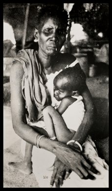
The truth of the matter is we tend not to address images that make us uncomfortable.  Take this image of “UR-Mutter” by Adrian Piper. It belongs to a series containing eleven photographs with different titles but of the exact same image- a blown-up photograph by photojournalist Peter Turnley. Piper is drawn to photojournalist Turnley’s images because it is a secular “Madonna image stripped of any spiritual connotations.”

ur mutter

  • Ur-Mutter #2
  • 1989
  • Photo-montage; created with silk-screened text.

This image alone is confrontational, verging on accusatory, making it uncomfortable to look at- but only to a degree. If I were to see it in a newspaper, I would want to look at it, but I would also want to look away. I would probably pay more attention to the story and text accompanying it. But what happens when photojournalism is adopted by an artist and becomes a word of art?

UR-Mutter uses the formula of red text superimposed on the photograph with different phrases. At first, I felt that the artist has appropriated a photojournalist’s work, and the labels are confining the image to a particular message. Before examining the relationship between words and text more closely, I believed Piper to be reducing the mother and child to just their suffering. In fact, the mother’s expression felt not only sad but full of anger and pain. I felt Piper was accusing the viewer by creating art to be displayed in galleries and museums. But was/is that really the case? Was Piper making the subjects ‘objects’ of observation or conversation?

Now I feel this image evokes sympathy and empathy from the viewer, AND subtly blames the audience, or rather, makes the feel accountable (to an extent) for the situation photographed.“Urmutter” means Earth Mother in German, but some students from class interpreted the title UR-Mutter, as “Your Mother” in English, as if one is muttering the term.

After reading Piper’s interviews, she is clearly emphasizing the African blood that runs in all of us. She wants the rest of the world to be aware of how we are contributing to the suffering of others in third world countries, especially those in Africa. (Notice “We made you” is written over the mother’s hands). Nevertheless, there is more complexity to the image than the titles suggest.

Some of these titles include, “We made you” (UR-Mutter #2 in the MHCAM’s work), “fight or die” (ex. “UR-Mutter #3”) and “Relax. We don’t want what you have” (ex. “UR-Mutter #4”).  Granted, the titles such as “We Made You,” emphasize the subject’s role as a mother, but the word “we” allow her to become the symbol of all struggling mothers, who must “fight or die” in order to feed their starving children. This mother represents collective suffering. But this woman is so much more than a mother. There is more to her than the icon of Somalian female suffering she has become.

After talking to Professor Martin, I could see how she sees the text as more than just labels, they actually open up space for discussion. What is the result of such an artistic endeavor? The combination of image and text does indeed “create a nuanced and confrontational effect in order to elicit a viewer’s response” (Piper). Relying less on the shock value of the image presented allows the viewer to really think about the complexity captured in one snapshot.

In The Critique of Pure Racism: An Interview with Adrian Piper, Piper explains that her technique of combining text and image exhausts “the range of available conceptual interpretations.” This allows the subject to be free of some bias by “peeling off one pseudo-rational categorization after another, so as to finally leave one with the bare experience of the subject itself, which is a universal icon” (95).

Normally a person is desensitized after looking at the same image repeatedly. However, by using the same image with a different title, Piper is forcing the viewer to look at the picture in a new light and reconsider the purpose of such an exhibit. It is hard to ignore the suffering. Though she becomes the face for Somalian mothers struggling, she also able to retain her identity (to an extent). It bothers me that the woman remains nameless, anonymous, but Piper is emphasizing the strong presence of the mother in all eleven images. When viewed within the context of the entire series, beyond individualistic suffering, her individuality is highlighted. Thus, the viewer is made to see the futility of categorization.

The woman fills up the space, and takes over the composition, pushing the boundaries while being framed or rather limited, by the size of the paper and the medium of photography itself. This is just one perspective, one side of her story- with this particular child (he/she is less visible but present, nonetheless). He/she is seen in relation to her, and despite the emphasis on the mother, I believe it is impossible to reduce her- and even her child, to the confinements of words.

The various words provoke us to do the same; to reject labels and accept this woman and child are real human beings, they have various roles in society as survivors, as fighters; they are more than images and words will ever be able to encapsulate.

Bibliography:

1) Piper, Adrian. Out of Order, out of Sight. Cambridge, MA: MIT, 1996. Print.

2) Piper, Adrian. “Cornered: a Video Installation Project” Transcript from Theory in Contemporary Art from 1985 (2005), pg. 186

3) Piper, Adrian, Maurice Berger, and Jean Fisher. “The Critique of Pure Racism: An Interview with Adrian Piper.” Adrian Piper: A Retrospective. Baltimore, MD: Fine Arts Gallery, University of Maryland, Baltimore County, 1999. Print.

Posted by: corri23j | December 12, 2015

Edward Gorey & Unsettling Children

In class we’ve been talking about the visual depictions of children in the Victorian Era – both of real kids (some of Julia Margaret Cameron’s photographs, “ghost mother” portraits, etc.) and of fictional ones (Alice’s Adventures in Wonderland). I find each of these subjects to have a certain element of the surreal or unsettling about them. Clearly Carroll’s intentions were to create a bizarre, nonsensical world for children to explore, but for the photographic examples the source of their vaguely disconcerting aura seems to stem more from the eyes of the viewer than the creator. In the case of the ghost mothers, shrouded figures or disembodied hands haunt the backgrounds of portraits of children – a fairly conventional method at the time, only creepy to our modern eyes. In class, some of us found a certain unsettling element to Cameron’s portraits The Double Star and The Bereaved Babes / The Mother Moved! – perhaps due to the enigmatic nature of the children’s facial expressions. All three subjects share a common theme: the absence or removal, to some degree or another, of the parent or the mother within the frame of the portrait or story.

I saw parallels with this association between the unsettling or surreal and the distance between children and parent in probably the most famous work of one of my favorite writer/illustrators, Edward Gorey. His drawings often depict vaguely dismaying and macabre scenes in Victorian-ish settings, and The Gashlycrumb Tinies is no exception. Twenty-six different children are on the brink of twenty-six untimely deaths, all without a responsible adult in sight (except if you count the Grim Reaper guy on the front cover).

What’s perhaps most horrifying is that though the text describes exactly what befell each poor child, the images only set the stage for the tragedy to come. It’s the viewers’ imaginations that must fill in the pieces, completing the actions to end up at each frightful conclusion. I also see echoes of the ghost mother pictures in that they were often taken to capture portraits of small children that would not live to see adulthood, much like these kiddies. Though they are depicted when still alive, death is lurking – here in the rhyming couplets, there in the shrouded-in-black mothers who bear more than a passing resemblance to the Grim Reaper.

21716P

Interestingly, the collection that Tinies was first published in was subtitled by Gorey Three Volumes of Moral Instruction, certainly a tongue-in-cheek designation that was perhaps along the lines of Carroll’s aim in Alice in Wonderland – to create a children’s story free of heavy-handed morality lessons. Gorey’s art shares a lot with the genre of surreal literary nonsense occupied by Carroll and Edward Lear – his stories are often filled with non-sequiturs that free themselves from the dull bounds of “standard” logic. The Object-Lesson, for instance, makes absolutely no sense, but it still forms an absurd yet somehow coherent narrative that ascribes to some form of logic right out of Wonderland.

Gorey’s work has other, more direct connections to what we’ve read in class as well – he provided illustrations for an edition of Bleak House (you can see that iconic, atmospheric bleakness in his art style, certainly), as well as famously creating the eerie animated introduction for PBS’s Masterpiece Mystery, where many Sherlock Holmes stories were performed.

t04-bleakhouse

In light of next week’s class on Dorian Gray and its dark, gothic themes, here’s what Gorey had to say about the intersection between gothic imagery, nonsense and children: “If you’re doing nonsense it has to be rather awful, because there’d be no point. I’m trying to think if there’s sunny nonsense. Sunny, funny nonsense for children — oh, how boring, boring, boring. As Schubert said, there is no happy music. And that’s true, there really isn’t. And there’s probably no happy nonsense, either.”


Posted by: wiber22m | December 10, 2015

Review: Reading and Conversation with Ruth Ozeki

Review: Reading and Conversation with Ruth Ozeki, author of My Year of Meats, All Over Creation, and A Tale for the Time Being

Ruth Ozeki is best-selling author, a professor an alumna of Smith College (though her mother attended Mount Holyoke!), and an ordained Zen Buddhist priest. Her books have won the Kiriyama Prize (My Year of Meats) and the American Book Award (All Over Creation) and her most recent novel, A Tale for the Time Being, won the 2013 Los Angeles Times Book Prize. She recently gave a reading at Mount Holyoke of selections from My Year of Meats and A Tale of Time Being as well as discussing her experience as a writer and filmmaker.

After listening to Professor Ozeki reading the selected segments of her novels, I can tell you without a doubt what a shame it is that she did not narrate the audiobook of My Year of Meats (though she is the narrator for the audiobook of A Tale of Time Being). Listening to Professor Ozeki speak and read was an absolute privilege. I have been to many events of a similar nature and have found that sometimes the most brilliant writers do not make the best speakers but Ruth Ozeki is absolutely the exception. Her writing is captivating and hearing her read it, using varied accents and subtle voice changes, was fantastic. I could have listened to her read for ages. Her pitch, pace, and presence were all excellent.

Another thing that sometimes falls short at these types of events is what the speaker has to say outside of just the reading and, once again, Professor Ozeki did not disappoint. She discussed her own experiences in filmmaking and television in relation to the experiences of the characters in her novels and talked about the development of novels and narrative voice. One of the most interesting things she had to say came up in talking about the modern day relevance of My Year of Meats as a novel that was written in 1998 and the similarities and differences in of today’s society and culture to the societal climate of the time. I found this especially significant because she was addressing two different points of the book, first the meat industry and second societal awareness of racial matters. She read a section of the book in which the main character, who is biracial, is asked where she is from, where she was born, and finally “what are you?” before stating that she’s an American, in a very powerful and strong scene. In discussing this particular section Professor Ozeki stated that she feels that “young people are more aware now” and talked about her thoughts about categorization and identification when it comes to being biracial.

The event was sponsored by the Mount Holyoke English and Critical Social Thought departments and the Five College Asian/Pacific/American Studies Program. Professor Ozeki was introduced by Professor Iyko Day, who did an excellent job, before the reading and who asked her some very thought provoking questions following the reading.

The problem with this event was the location. While Professor Ozeki was brilliant, it was almost unbearable to sit through her talk because of the multitude of problems the location caused. The event was held in the New York Room of Mary Wooley Hall and was very much packed, which made the room stiflingly hot. On top of that, there was a very, very loud event going on in Chapin Auditorium, including drums and noisemakers, which was incredibly distracting throughout the entire reading and talk. People were walking around and talking loudly right outside the New York Room and accidentally banged the door a couple of times, which was all the more noticeable because of how small the room is. Because the room was both small and packed, every noise that anyone made was very obvious and people coming in late or needing to excuse themselves was very distracting. The microphone which was set up also seemed to stop working at points or providing feedback which was painful to listen to, to the point that Professor Ozeki stopped at one point to ask the audience if they were able to understand her through it.

The other big problem with the space was the way the seating was organized. The chairs were set up in rows, all on the same level, facing the podium at the front and it was very difficult to see Professor Ozeki as she spoke. When she and Professor Day sat down for the conversation portion of the event following the reading it was impossible to see unless you were seated in one of the front rows. This, combined with the outside noise and the problems with the microphone, made it very difficult to fully hear the second part of the event. Combine that with the stifling heat and crowded room and sitting through the second half became almost agonizing. None of these issues were the fault of Professor Ozeki, of course, but they did detract from the experience quite a bit.

In the future I would suggest that readings and talks perhaps be held elsewhere, especially in cases where there are earsplitting events going on in Chapin at the same time. Ultimately though, even with all the issues with the venue, hearing Professor Ozeki talk was absolutely worth it. I just have to stress again how powerful her selections were and how remarkable her thoughts and speech were. Hearing Ruth Ozeki read was an absolute privilege.

Posted by: amartinmhc | December 9, 2015

More King Lear photographs by Julia Margaret Cameron

Following up on Mary’s wonderful post, I wanted to share two more of Cameron’s photographs restaging King Lear. They are very complex photographs in their interpretation and engagement with the play, but I’m also interested in the way that, by representing one moment from a play, they anticipate the logic of the film still.

Thanks to Kay Heffernan for leading me to these photographs.


Posted by: avila22a | December 8, 2015

Victorian Cat Ladies

catlady3

Though keeping cats as pets began in the earliest of times, it became increasingly popular in the 19th century. Animals in general became status symbols and symbols of the ability to control the uncontrollable.

catlady2

In particular, cats and women became closely related. No matter what the sex, cats and women were compared because of the understanding that both were domestic and indoor creatures. In general, men compared women to cats in a largely negative manner: “An animal so keen on maintaining her appearance, so silky, so tiny, so eager for caresses, so ardent and responsive, so graceful and supple….; an animal that makes the night her day, and who shocks decent people with the noise of her orgies, can have only one single analogy in this world, and that analogy is of the feminine kind” (Toussenel, Zoologies Passionelle). The two were often thought to have dispositions of prostitutes, signaling a hard and fast belief that women were either chaste or promiscuous, domesticated or wild.

catlady1

Because of their perceived devious femininity and sexuality, women were often compared to cats and vice versa. Both were said to be eager to escape domesticity and likely to be seduced by immoral nature.

catad3

Like Victorian women, cats were described to be “the embodiment of elegance, grace and agility… Very little, in fact, is needed to make the Cat stray from the paths of domesticity and return again to the happier hunting-grounds of its remote ancestors.”

Besides stereotyping women, cats became a new mascot of advertising. Most fittingly cats were seen in a large amount of soap advertisements and became synonymous with cleanliness. 

Posted by: kishi22s | December 7, 2015

Paper Portraits

As I was looking through images for an art presentation a few weeks ago, I came across some amazing papercut artists.  With such an intense focus on portraiture in the Victorian Era, it is not surprising that the idea of owning a physical image or likeness of oneself, a loved one, or even a “celebrity” figure, extended to the more affordable material of paper.  Way back in our second class (I think), we saw a silhouette of a man placed in a printed lithograph scene.  The man’s position looked like a painted portrait, yet the construction pushes away from reality and the idea of “trust” in the accuracy of the image.  Simultaneously, the possession and creation of this image in such a formal manner refutes the call for reality; it must have some truth and value for it to survive more than a century.

bp18-07c

Fig. 1. Samuel Metford (United States, 1810-1890), Thomas Goddard (1765-1858). Cut-out full-figure silhouette from matte black coated white wove paper with graphite, opaque watercolor and white paper insert (collar) mounted to a lithograph. Bequest of Maxim Karolik, Museum of Fine Arts, Boston, 1964.1139. (from <http://cool.conservation-us.org/coolaic/sg/bpg/annual/v18/bp18-07.html&gt;.)

Though most silhouettes are not as atmospheric, the art’s simplicity to express a form with shape astounds me.  Its graphic quality somehow expresses the same information as a painting, yet allows for imagination to fill in the alluded twists and turns of the detailed paper.  In our modern society, we can easily use photography as a mode of portraiture, instantly attaining a person and the memory of that time.  Strangely, Disneyland and Disney World, in the attempt to recreate an idealized “Main Street,” have silhouette artists and apprentices to make visitors’ profiles into a memorialized moment and memory of their visit to the “magical” amusement park.  Here’s a video of their silhouette artists in action:

My first experience with the art of silhouettes likewise occurred at Disneyland, my eleven-year-old self astounded at the quick snips of the scissors as my image magically appeared out of a smooth, small rectangle of black paper.  One year, when my sisters and I went with our church, I had each of us sit for our silhouettes, combining them into a single, layered portrait for my mother.  It still hangs in our home!  I think that is why I’m drawn to papermaking artists: the time, effort, planning, practice, and detail sets them apart from our normal “instant gratification,” turning their work into art.

Of the small group of people experimenting with papercutting, Peter Callesen, a Danish contemporary artist, uses regular printer paper to create amazing papercut pieces.  Most deal with absence and negative space, as the entire piece is created from the single sheet of paper.  He somehow creates three dimensional figures, grounding them with shadows and imagery of absence.

Fig. 2. Callensen, Peter. Closet. 2005. Acid-free A4 80 gms paper and glue.

The supernatural creatures in silhouette seem to emerge from the small wardrobe, ironically forming a cross-like shape in the creation of the piece.  It doesn’t seem real, but the three-dimensional quality of the work negates the simple, pictorial shadow of the scary, demonic creatures.

Fig. 3. Callesen, Peter. Alive, but Dead. 2006. Acid Free paper, glue, acrylic paint, and oak frame.
Another piece I love, Alive, but Dead, again uses color to create life out of the papercut, even allowing some of the poppies’ petals and heads to drop at the bottom of the frame.  They are grounded in the plain white paper, while peeling into the physical world, forming real shadows from their constructed forms.

In comparison, Yulia Brodskaya uses a quilling technique, “the placement of carefully cut and bent strips of paper–to make lush, vibrant, three-dimensional paper artworks” (Brodskaya).  She layers paper vertically, instead of horizontally, somehow creating a new form of the silhouette that has texture, color, and depth.  The following piece, Coins, utilizes the classic Russian imagery present in most of her work.  A grandmother (or babushka) simultaneously comes forth and recedes in the crazy, dreamy, swirling colors surrounding her form.  What she is actually doing (picking up coins) becomes arbitrary in the piece, the color and doubleness from Brodskaya’s application; it involves the viewer in the space without touch.

Coins

Coins

Coins

Fig. 4-6. Brodskaya, Yulia. Coins. n.d. Paper and glue. <http://www.artyulia.com/index.php/Art/2&gt;.

I might be still recovering from re-reading Alice in Wonderland, but the longer I look at Callesen’s and Brodskaya’s work, it grows “Curiouser and curiouser!”  Please feel free to explore the other amazing works by these two artists, and share what you think of papercutting in relation to art and portraiture!  Here are their websites:

Yulia Brodskaya:  www.artyulia.com

Peter Callesen:  http://www.petercallesen.com/home/

Works Cited

Brodskaya, Yulia. “About me.” Yulia Brodskaya. N.p., n.d. Web. 7 Dec. 2015.

« Newer Posts - Older Posts »

Categories