Posted by: Kay Heffernan | December 2, 2014

Synesthesia in the Victorian Era

We discussed the haptic or tactile nature of Julia Margaret Cameron’s photographs a few weeks ago, speaking briefly of the synesthetic. The proximity of the sitters and the  brought many of them close enough to touch; the rough-hewn and flushed qualities of their skin lets us imagine how their faces were marked by color, warmth, and age.

Wanting to know more about Victorian understandings of synesthesia, a neurological “mixing” of two or more senses, I came upon a beautiful and strange collection of images in a book entitled Thought-Forms. Published at the very end of the Victorian era in 1901, this book, written and illustrated by Annie Besant and Charles Leadbeater, argued that ideas, emotions, and other intangible states of being manifested in visual form, in “thought-form.”

Besant and Leadbeater were members of the London Theosophical Society, the initial aim of which was to enrich contemporary knowledge of the Occult. (W. B. Yeats was also a member.) Considering their book as the first synesthetic archive of its kind – “[these thought-forms] are… actually observed” – the two occultists synthesized photography with color symbology in artistic representations of mental experience. They focused on two sensory pairings, sight with sound and sight with touch, rendering the invisible not just visible, but colorful.

In his article on the Victorian Occult and synesthesia, Benjamin Breen discusses the transformation of a Newtonian theory of color to a mystical or spiritual one, led by Madame Helena Blavatsky, a founder of the Society. A chart provided in Thought-Forms mapped out the colors “seen” and their correlating emotional, mental, or spiritual states.

"Meaning of the Colors," a chart provided in "Thought-Forms" by Besant and Leadbeater.

“Meaning of the Colors,” a chart provided in “Thought-Forms” by Besant and Leadbeater.

“Read more” to see examples of these thought-forms!

Read More…

Isabella’s comment about the inefficacy of Alice in Korean reminded me of my forays into the world of the Japanese translation. I speak of the “world” of the translation because isn’t just one Japanese translation but dozens, and because the inefficacy of these translations didn’t prevent them from inspiring an obsession so intense that Alice might be considered one of the most important influences of modern Japanese culture. Japan was the first Asian country to translate Alice – the first edition was published serially in 1908 – and dozens of other attempts proceeded over the following decades. However, most translators concern themselves with presenting a story that a Japanese child would understand rather than attempting to convey Carroll’s wit or wordplay. The 1908 version added conventional Japanese morals and made Alice marry a king as reward for her bravery at the end, and even the most recent translations convert all the feet and miles to the metric system. Without the linguistic complexities of the original, the dominant features of Alice in Japanese become surrealism (which in Japanese sometimes veers into unhinged nonsense, as in a phonetically-rendered “Jabberwocky”) and the perfect Western “cuteness” of the protagonist. “Alicemania” in Japan focuses primarily on the latter feature.

Illustrations from a Taisho-era edition of Alice.

While Alice is remarkable in the West in that it is a book about a girl that isn’t inherently a girls’ book, in Japan it has been intrinsically connected to shoujo (girls’) culture since its 1908 publication in the magazine Shoujo no Tomo (Girl’s Friend). Among the many 20th-century shoujo works that draw from Alice are Pandora Hearts, which features Alice as a godlike controller of worlds, and Alice in the Land of Hearts, which features a teenage Alice meeting attractive male versions of all the Wonderland regulars. Beginning around the 1980s, shoujo culture birthed kawaii culture, an aesthetic devoted to everything cute that often includes a heavy dose of Alice imagery. For example, the official birthplace of Hello Kitty, the central icon of kawaii culture, is England, which Sanrio states is an homage to Alice.

Hello Kitty in a 2014 Alice-themed musical show.

Kawaii culture perhaps manifested most dramatically in a youth fashion subculture inspired by Alice’s famous outfit: knee-length dresses puffed out with crinolines, frilled pinafores, stiff headbands, stockings and Mary Janes. The style has been most widely known as “lolita” since the 1990s, when the crossdressing pop star Mana compared his crinolined groupies to that other literary prepubescent, but both the designers and wearers of the style maintain homage to Alice. All of the seven leading lolita brands (Angelic Pretty, Baby the Stars Shine Bright, Moi-Meme Moitie, Innocent World, Metamorphose, Victorian Maiden, Mary Magdalene) have released at least one design named after Alice. One wonders what Carroll would have thought of these thousands young women in their late teens and twenties – perhaps his least-favorite age – traipsing around Tokyo dressed as his muse.

Image from Innocent World’s 2013 catalog.

Metamorphose’s Alice-themed collaboration with Disney.

Quebecois lolita Fanny Bissonette in a Mary Magdalene dress.

At this point I realize that a short blog post is really not the place to try to delineate all the intricacies of Alicemania in Japan. I haven’t even mentioned the Alice-themed restaurants in Tokyo or the size of the Alice section in Tokyo Disneyland or Miyuki-chan in Wonderland, celebrity shoujo author CLAMP’s  sexploitation-esque farce about bikini-clad versions of Wonderland characters propositioning a bemused Japanese schoolgirl. Alicemania probably reveals something profound about post-Perry Japanese culture, but for now I have only the following conclusion: there is something about the immortal seven-year-old that fascinates Japanese audiences, but it’s something more superficial than Carroll’s linguistic acrobatics.

Montgomery, Lall D. “The Eastern Alice.” Literature East & West 7.1 (1963).

Suzuki, Michiko. Becoming Modern Women: Love and Female Identity in Prewar Japanese Literature and Culture. Stanford, Calif.: Stanford UP, 2010.

Wakabayashi, Judy. “Foreign Bones, Japanese Flesh: Translations and the Emergence of Modern Children’s Literature in Japan.” Japanese Language and Literature 42.1 (2008): 227-55.

Yano, Christine Reiko. Pink Globalization: Hello Kitty’s Trek across the Pacific. 2013.

Monden, Masafumi. “Transcultural Flow of Demure Aesthetics: Examining Cultural Globalisation through Gothic & Lolita Fashion.” New Voices: A Journal for Emerging Scholars of Japanese Studies in Australia 2.1 (2008): 21-40.

Posted by: jordanelassonde | December 2, 2014

Image Manipulation in Alice

Alice_In_Wonderland_(2010)_coverAfter reading Alice last week, I was reminded of the recent Alice movie remake (the one with Johnny Depp). I happen to own the movie and over break, despite a lack of power (praise be to generators) and perhaps because of the lack of cable, my family ended up watching an abundance of movies including Alice in Wonderland.

While watching the movie, I was struck by how much the movie departed from the actual text. The movie was a mash up of Alice’s Adventures in Wonderland and Through the Looking Glass (if only because the slaying of the Jabberwocky occurs on a chess board). While the differences are interesting, though perhaps not unexpected, they are not what really caught my interest.

The Alice in Wonderland movie is unique in its distortion of the human figure. The distortions are reminiscent of fun house mirrors. In the text, Alice is distorted a few times by eating and drinking certain concoctions and this does happen in the movie. However, the movie expands on this idea by distorting other characters. The Hatter’s eyes are overly large and change color. The Red Queen’s head is disproportionately oversized for her body. Stayne, the Knave of Hearts, looks stretched and oddly tall. These distortions create a weird “wonderland” atmosphere and in the realm of this movie, the distortions of these characters are “real.” The members of the Red Queen’s court, however, have unreal or put upon distortions. They use prosthetics to change their appearance.

images

images-1

imgres

010AIW_Holly_Hawkins_001

We talked about manipulating images in class and I can’t help but link that idea to the Alice movie and to life. What is it that makes these courtiers manipulate their self-image? While the courtiers do it in a very drastic sense, large noses, droopy ears, in a very basic sense we, as human beings, do this in life quite often. Makeup is the example that comes to my mind first. We use makeup as a method of altering self image in order to change how other people see us. In a sense, we have been manipulating images much longer than we have had photographic images to manipulate.

Posted by: emkamm93 | November 30, 2014

The Familiar Celebrity

An excerpt from The New Yorker’s introduction to their famed staff photographer Martin Schoeller reads “in traditional studio sittings, [his] signature was an unflinching attention to facial detail; outside of the studio, he had a flair for constructing scenarios that would allow his subjects’ idiosyncrasies to be revealed”(NY).

George

I thought his portrait of George Clooney was particularly interesting. It made me wonder about the meaning of blinding someone with their own eyes? What are the implications of blocking viewers from Clooney’s gaze with a constructed image of Clooney’s gaze? I think, working within the confines of his medium (as in I want to think that the viewer is supposed to imagine George is really in front of her, and that if the “superimposed” strip were removed, she would see his “real” eyes, and not another constructed image) that Schoeller is playing with the idea of celebrity itself.

Clooney’s lips are turned up slightly hinting at a smile indicating happiness, or at the very least compliance; and the wrinkles and steady gaze of his “eyes” produce a similar emotion. The thing about the superimposed eyes, though, is that they make the expression. If the mood of the eye’s was different, Clooney’s mouth could easily also be interpreted as terse, afraid, bored, etc.  When we look at photos of celebrities, especially studio portraits, we are seeing a very particular and constructed presentation of that person.

Schoeller acknowledges this — that even in his photos, even with gaze of the camera as intimate as it is (see this post about how the close up of a face is the “power shot”) we, as viewers, will never know the “real” George — only a constructed image of him.

Gaga

The second picture of the batch is actually my favorite because of its use of colors. Lady Gaga is known for looking a little bit…weird. Her outfits are definitely outside the norm and yes, her performance persona pushes the boundaries of the public’s comfort zone, but that does not mean that Stefani Germanotta, the girl behind all the glitter, does not personally feel the impact of any backlash.

As the bruise on her arm carries the same magenta hue as her eye shadow and hair, the viewer is immediately aware of the connection between the two. We are shown a physical manifestation of the the public’s negativity about her appearance, and how it impacts her. But even so, even her bruises are fashionable.

I think it’s important to frame these photos within the conversation about image ownership that we had quite early in the semester. When your picture is so widely available, it makes sense that people who don’t even really know you could begin to feel like they do, and thus hold opinions on your life, appearance, and choices. Schoeller pushes back against this scary idea, whose inception I imagine came with the beginnings of Victorian-era photography.

You can see the rest of the photos here. Let me know what your thoughts on the rest of them are, particularly how they play with the idea of celebrity, and challenge our inclination to feel like we “know” these people. Especially the portrait of Steve Carell. I have no idea what’s going on with that one.

Posted by: mclea22h | November 29, 2014

Another Suggestive Mother Portrait

IMG_5142

I was at The Museum of Fine Arts in Boston the other day and ran across a little exhibition about The Pictorialists, a group of photographers from around 1900 who worked to bring their medium into the realm of fine art. While roaming around the show, I discovered The Manger by Gertrude Käsebier, an image from 1899.

The picture, a mother in long white robes and a veil who peers down at a “baby” nestled against her, reminded me of our conversation about Julia Margaret Cameron’s Madonna portraits and the Victorian-era hidden mother images. But instead of the mother cut out of the image like in some photos we saw in class, the baby here is totally invisible in this mother’s arms—in fact, there’s no baby at all! I was a little alarmed when I first learned that the bundled blanket is just a prop in the image; the absence creates a feeling of loss or longing comparable to the sleeping/dead baby images we’ve also looked at. While the image is of a nativity scene, I like to think it could be interpreted as the reverse: a death, a mourning, rather than a birth. Whatever the case, Käsebier’s ability to transform a “normal” woman into a consummate Madonna figure here mirrors Cameron’s photographic talents: celebrating and using the ordinary to make staged arrangements authentic and emotional.

Käsebier, also a mother who took up photography in her forties like Cameron, became a successful photographer quickly after she created The Manger. Aligning with American Alfred Stieglitz, a pioneer in the world of photography and promoter of pictorial photographers, Käsebier took her painting knowledge from art school and applied it to a new kind of image-making style. After the first Kodak camera came out in 1888, photographers of Käsebier’s kind worried about the normality of the photograph, a product of its new accessibility. Hoping for legitimacy as an art form, the group pulled current art trends from painting—impressionism, symbolism, and the Arts and Crafts movement, for example—and incorporated them into their images. The blurred light and shadow and overall soft quality of The Manger heighten its gestural or painterly quality, for example. What do you think?

A closer look:

06866701

Käsebier, Gertrude. The Manger. 1800. Platinum print.

Posted by: Kay Heffernan | November 29, 2014

Wilde and the Disease of the Aesthete

Although some of us, myself included, have not read the works of Oscar Wilde before, I would guess that many of us are familiar with Wilde’s (in)famous persona. Although he accomplished much as a poet in college, Wilde became most famous for his “art for art’s sake” mantra after he traveled to the States in December 1881, giving lectures on his thoughts about art, the role of the artist, and aestheticism. These lectures crystallized Wilde as the face of not only the aesthetic movement, but also the antagonizer of normative masculinity.

Much to the chagrin of art and cultural critics in both America and Britain, Oscar Wilde paraded his ostentatious dress, his velvet jacket and signature carnation in its breast pocket, both green. In her article “Fighting Infection: Aestheticism, Degeneration, and the Regulation of Artistic Masculinity,” Sarah Burns discusses the pathologizing of physical appearance and dress, focusing most on the case of Wilde. Linked to the art movement Wilde emblematized, social and moral “decay” could be seen in Wilde’s bohemian aesthetic. The colors green and yellow, for example, were thought to be indicators of weakness, disease, and infection. By extension, Wilde and all he stood for posed an insidious threat to, in Burns’ view, normative masculine behavior and dress. Burns turns to cartoons of the time that either depicted or drew on/alluded to Wilde’s persona, illustrating the dichotomizing of “heathlful” and “diseased” masculinities.

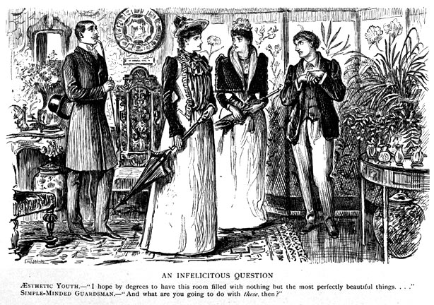
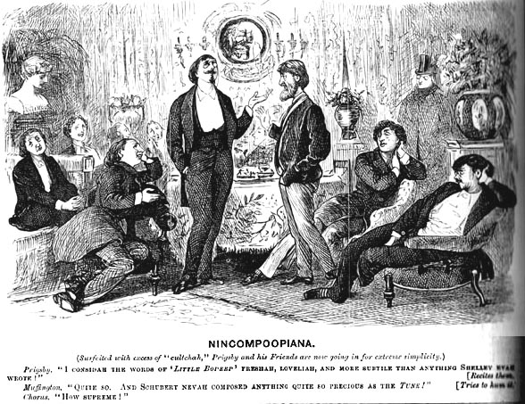
Most of the cartoons Burns cites were drawn by Georges du Maurier, a French illustrator and novelist. Du Maurier produced a series of cartoons that satirized other figureheads of aestheticism, including Charles Baudelaire and Dante Gabriel Rossetti, entitled “A Legend of Camelot,” in 1866. Du Maurier continued this successful mocking theme in later comics. These comics, such as An Infelicitous Question (1897) and Nincompoopiana (1879), depicted the “aesthete in society” as well as confrontations between the effeminate and the strapping or “manly” man. Du Maurier found inspiration in Wilde, as similarities in dress and posture in depictions of the aesthete and in photographs and descriptions of the writer are undeniable.

"An Infelicitous Question." George du Maurier, 1897.

“An Infelicitous Question.” George du Maurier, 1897.

"Nincompoopania." George du Maurier, 1879.

“Nincompoopania.” George du Maurier, 1879.

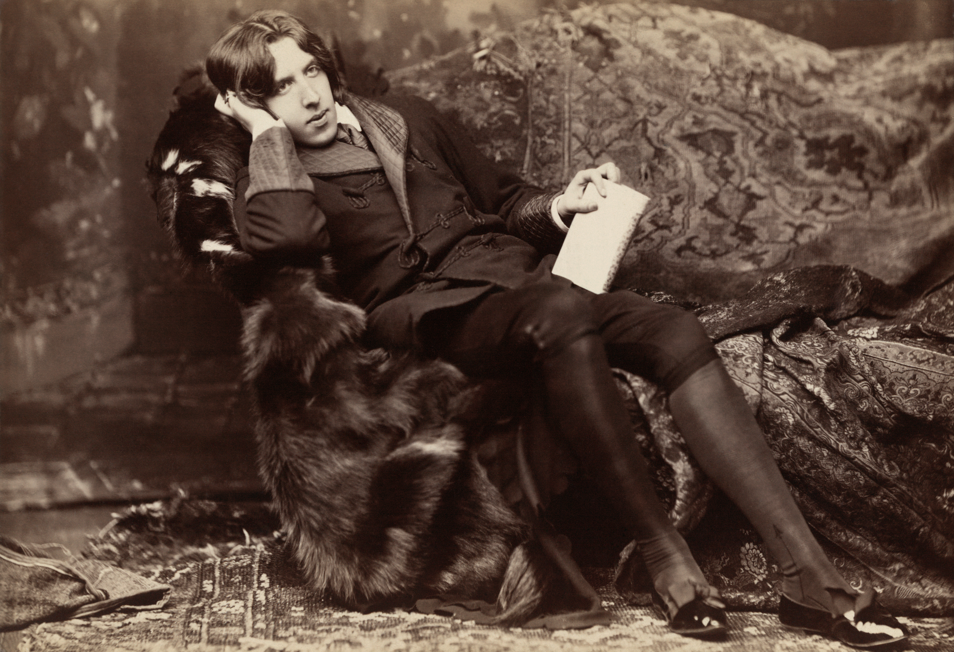
For comparison, here’s a photograph of Wilde.

A_Wilde_time_3

Looking at these cartoons, it’s easy to tell which characters are based on Wilde (and James McNeill Whistler, an American artist who created the slogan for the aesthetic movement, “art for art’s sake”). In Nincompoopania, the Wilde-figures are slouched and sprawled like Wilde in the above photograph. All the men in the parlor take this same position. Rather than sitting or standing upright with strong muscles, the men droop – aestheticism has weakened their muscles.

Two women must choose between the strapping gentleman on their left and the aesthete on the right in An Infelicitous Question. Here, du Maurier depicts questions of “proper’ gender performativities of men and women. Burns writes about the outrage cultural critics felt at Wilde, for not only promulgating alternative forms of masculinity, but also providing for women a prominent feminine figure in society. As women flocked to Wilde, critics – mostly men – foresaw a prioritizing of women’s values and rights (e.g., suffrage). This cartoon illustrates the moment of decision for women: to side with Wilde’s sickening subversion or dominant/normative and “healthful” ideas of gender.

This notion of insidious or infectious masculinity became so terrible and widespread that du Maurier and other cartoonists began characterizing Wilde as fungus and sunflowers. Interesting to consider the use of a specific plant in relation to nationalism/national identity. Both comics are of American origin.

“American Wilde.” Anonymous, 1882.

“The Modern Messiah.” George F. Keller, 1881.

The mixed symbolism of the sunflower in these two cartoons exemplifies the mixing of slanderous labels in the Victorian age. Metaphors and language of the body, disease, art, and masculinity culminate in criticism and cartoons. As Burns concludes, this mixing contributed to a dangerous tension surrounding the artistic body and, more broadly, the male body, which began in the nineteenth century and continues today. Wilde’s ostentatiousness and flamboyance is, after all, how we remember him – aside from his art, that is.

Works Consulted:

“Fighting Infection: Aestheticism, Degeneration, and the Regulation of Artistic Masculinity,” Sarah Burns. from Inventing the Modern Artist: Art and Culture in Gilded Age America. 1996. Print.

“George du Maurier, Illustration and Novelist.” from The Victorian Web.

Oscar Wilde biography, from the Official Oscar Wilde website.

“Part 5: Reading Wilde, Querying Spaces – American Wildes.” from NYU.

Images cited above.

After we talked about commodity culture with McClintock’s Soap and the Great Exhibition of 1851, I began to think about a contemporary version, in terms of cultural impact and function, of the Great Exhibition. While I’m unsure if we have anything that functions as a massive shopping mall, world fair, and department store all at once, the Great Exhibition was the beginning of commodity culture for the masses. In today’s capitalist society, it’s extremely difficult to understand the kind of impact it must of had on all those who participated in that first exhibition; for the first time, anyone could walk in, look, and purchase material goods. One giant space for all classes. For those of us who perhaps aren’t familiar with the history of world fairs and other massive “thing” displays (AND in honor of the horror that is Black Friday,) I present you with the evolution of commodity culture in pictures—

Great Exhibition of 1851

Centennial Exhibition, 1876. Philadelphia.

Camel Tobacco Billboard Exhibition, 1928

New York World’s Fair: The World of Tomorrow
1939

Osaka Expo, 1970

Mall of America, opened 1992

World Expo, 2010. Shanghai.

What do you think will be the next big form of mass commodity culture? How much longer do you believe we will have expos and conventions in person? With the ever-growing popularity of Cyber Monday, my guess is online shopping (Ebay & Amazon for example among all major department stores) and virtual conventions will soon be all the rage (literally ALL)…

In case you’re interested in what the next World Expo will look like, click on the link below. It will take place in 2020 in Dubai.

Dubai World Expo

Posted by: smartyy638 | November 27, 2014

Royal Photographic Society: a Brief History

I was recently forwarded an article about an amazing exhibition beginning December 2nd at the Science Museum in London. It features several of the photographers that we have been studying in class: Julia Margaret Cameron, Charles Dodgson (aka Lewis Carroll), and Roger Fenton, one of the world’s first war photographers. The exhibit is titled “Drawn by Light: The Royal Photographic Society Collection” and contains over 200 photographs from the collection of the world’s oldest photographic society. If you’re interested in more about the exhibit, check out the two links below:

Drawn by Light exhibit 

BBC “Drawn by Light” press release

Royal Photographic Society

As far as I can recall, we have not explicitly discussed the Royal Photographic Society in class. Seeing as it contains work from many of our favorite Victorian photographer pals, I figured a brief intro about the world’s oldest formally organized collection of photography might be interesting!

The Royal Photographic Society was founded in 1853 for the ‘promotion of the art and science of photography.’ It originated from the Edinburgh Calotype Club in 1843, a group that consisted of twelve or so “gentlemen amateur” photographers so that they could discuss technique, the science of the camera, and photography as art. Several members of the Calotype Club then formed a Calotype Society in London, eventually becoming the Royal Photographic Society. The society was formed smack dab in the middle of the so-called “Golden Age” of British photography. Among it’s founding members were Frederick Scott Archer, the chemist, Hugh Welch Diamond, an early British psychiatrist and pioneer of psychiatric photography, and Sir William Newton, a well-known miniature painter. The society was staunchly supported by Queen Victoria’s husband, Prince Albert. Now in its 161st year, the Royal Photographic Society has expanded to include contemporary photographers such as Donavon Wylie, Terry O’Neill, and Martin Carr. This group is responsible for much of the circulation of early photography, specifically war and prison photography.

If you’d like to know more, definitely check out their website. RPS

Side note: Why can’t we casually go to London and see this exhibit and then check out the Photographer’s Gallery?? If any of you have been before, I envy you.

Posted by: Hyeonjin | November 21, 2014

More Carroll Madness

After our discussion on Alice’s Adventures in Wonderland and the frustrations we had with the text, I had to pull out my own copy to find a section entitled “Puzzles from Wonderland” that had some frustrating yet entertaining riddles. We’re all aware that Carroll is very good with wordplay and riddles, so I thought it would be fun to share three with everyone, Carroll’s solutions included.

Read More…

Posted by: emilyobedilio | November 19, 2014

Wilde and Evil Boyfriend: the tale continued

GUYS. GUYS. GUYS.

I would like to continue the story of Oscar Wilde, evil boyfriend (Lord Alfred “Bosie” Douglas), and evil boyfriend’s dad (The Marquess of Queensberry).

It’s so great. And also not so great, since it ends super-tragically, forced labor-style. But I’m getting ahead of myself.

In class, I mentioned how Wilde had an evil boyfriend. Both of them are pictured here, being dandy and in (toxic) love.

Wildeanddouglas

Evil boyfriend Douglas had an evil dad named the Marquess of Queensberry, who, to put it mildly, disapproved of their relationship – not because it was somewhat dysfunctional, but because it was, well, gay.

So tensions built up, as they do. Things seemed to come to a head with an incident in which Queensbury showed up to a performance of The Importance of Being Earnest with a bouquet of rotten vegetables, which he intended to throw onto the stage. Wilde learned of this plan and barred Queensberry from the theater. Queensberry countered with this tasteful note:

Somdomite

In normal handwriting, this translates to “For Oscar Wilde posing Somdomite.”

Although I can’t find at present a source to corroborate this, I’ve heard tell that Queensberry purposefully spelled “sodomite” incorrectly so that if Wilde sued him for libel, he could argue that he hadn’t actually called Wilde a “sodomite.” Just a “somdomite.” Which means nothing, except for the fact that it’s obviously the word “sodomite” with an extra M in it.

But back to the story. Wilde did sue Queensberry for libel, in spite of the fact that all of his friends (except boyfriend Douglas) told him it was a terrible idea. Queensberry was arrested promptly. The only way he could claim his innocence was by proving that Wilde was, in fact, engaging in sexual relations with other males. This was not terribly difficult to do. Queensberry was acquitted, and Wilde was promptly tried and convicted for sodomy and gross indecency. He spent the next two years doing hard labor. Three years after his release, he died ill and impoverished.

Which is sad, obviously.

I’m sorry if I sound flippant. Like Oscar Wilde, I sometimes pretend that I don’t take life very seriously.

Anyways. My only source for all of this is Wikipedia. I couldn’t make this stuff up even if I wanted to. So ends this tale of sodomy, tragedy, and rotten veggie bouquets.

Go here and here for further (and endless) fascination. Have wonderful Thanksgivings.

« Newer Posts - Older Posts »

Categories